
"It's time to reconsider the whole colour of the year carnival"
With its choice of a shade of purple, which it claims is blue, as colour of the year, Pantone has once again failed to use the opportunity to talk meaningfully about how colour reflects moments, says Michelle Ogundehin.
It's time to reconsider the whole colour of the year carnival. The extraordinary hiatus of the last two years granted us a reprieve from trends as we knew it. Bigger issues ? health, community, sustainability, the climate ? came to the fore and we had a moment to consider what we liked for ourselves.
And yet, most of the big paint companies alongside Pantone, the self-acclaimed "global colour authority for the design community", persist in declaring a single shade as emblematic for the year ahead.
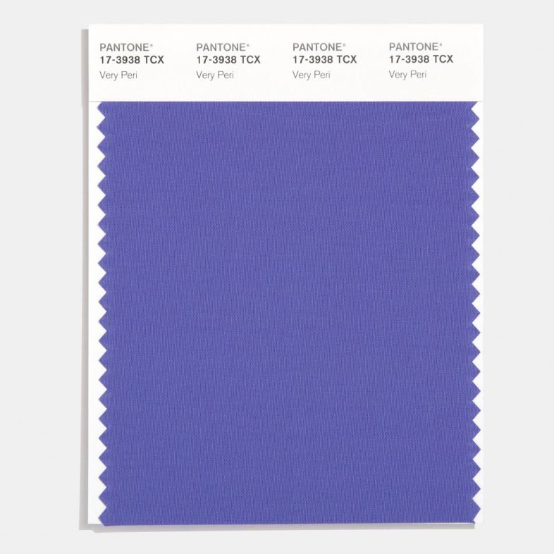
Somehow, trends pegged to the sentiments of a single company now seems wrong. Previously, it felt more fun. Today, the societal landscape has been fundamentally altered and yet this colour of the year (COTY) carnival continues. And when we know it's just a huge marketing exercise, it feels especially outdated. Of course, you could cheerfully ignore the whole spectacle were it not for the aggrandising justifications which accompany such pronouncements. There's also the fact that Pantone insist on defining its latest release as blue: "a dynamic periwinkle blue hue with a vivifying violet-red undertone".
Pantone also call it Very Peri, a name so awful it doesn't merit further mention
To even primary age children, that's purple. If we're going t...
| -------------------------------- |
| TRAZO DEL PERFIL DE UNA ESCALERA. |
|
|

Villa M by Pierattelli Architetture Modernizes 1950s Florence Estate
31-10-2024 07:22 - (
Architecture )


