"Less is not always more" say commenters

In this week's comments update, readers are debating car makers rebranding with flat versions of their logos and sharing their views on other top stories.
Nissan, BMW and numerous other car manufacturers have reverted back to flat designs of their logos having rebranded with three-dimensional, chrome-effect logos in the 80s and 90s.
Thanks to advances in technology, logos are now designed primarily with screens in mind ? simplified, two-dimensional logos replicate better on screens and in miniature as app icons.
"Cheap is the only word that can describe how cheap they look"
We rounded up seven examples of logos to demonstrate the change in style and readers are divided.
"Cheap, just cheap," said Raulin Miami. "Cheap is the only word that can describe how cheap they look." "Less is not always more," added Ken Steffes.
"The old logos were okay," continued Zea Newland. "I fail to see the necessity for flat redesign as today's digital graphics and displays are good enough to display complex graphics."
Steve Layden disagreed though: "I love the flat logos. So much cleaner and more versatile. Just like the hood ornaments of a few decades back look a little ridiculous now, having a stamped piece of chrome is going to look outdated in a few years as well. The options are broad ? laser etching, printed logos, glass, not to mention the digital formats. Bring on the change."
What do you think of flat logos" Joi...
| -------------------------------- |
| ZAPATA. Vocabulario arquitectónico. |
|
|
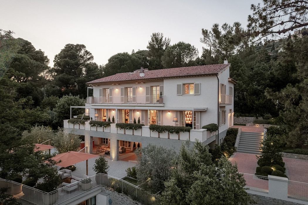
Villa M by Pierattelli Architetture Modernizes 1950s Florence Estate
31-10-2024 07:22 - (
Architecture )
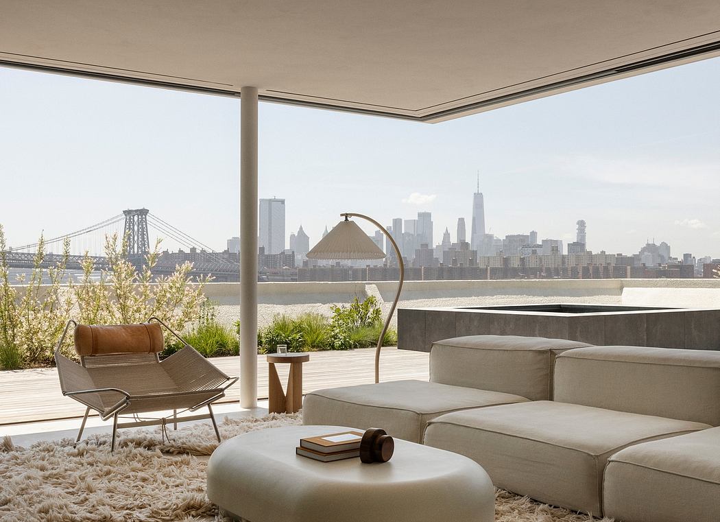
Kent Avenue Penthouse Merges Industrial and Minimalist Styles
31-10-2024 07:22 - (
Architecture )


