
Ace & Tate's Copenhagen eyewear store features blocks of primary colour
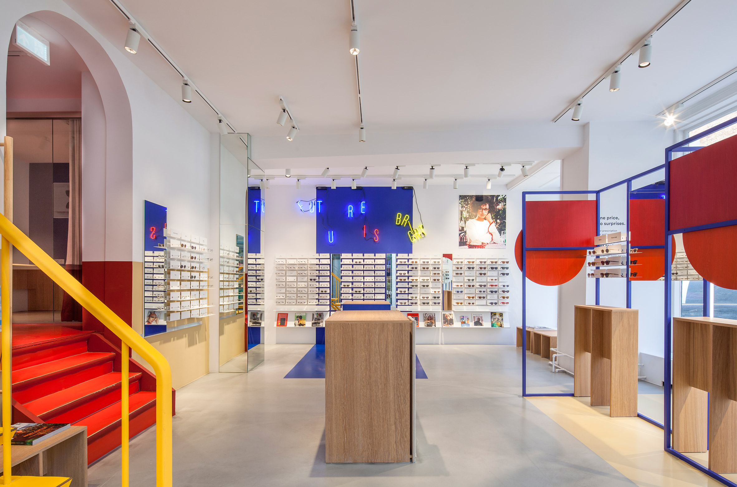
Spacon & X designed the interior for Ace & Tate's new glasses store in Copenhagen using geometric shapes and primary colours to evoke the experience of entering an artist's studio.
The new space is located in the old town of the Danish capital on Ny Ãstergade. It consists of stark, minimalist concrete floors and white walls that have been animated by blocks of red, blue and yellow.
Spacon & X wanted to use the bright colours to create an "energetic and playful aesthetic" that would match Ace & Tate's visual identity.
The store is divided into a front and back section, separated by a curved archway and a yellow spiral staircase leading up to the first floor. Floor-to-ceiling windows wrap around the store, allowing natural light to flood the front room.
Spacon & X found inspiration for the decor by imagining what the studio of avant-garde artist Franciska Clausen would look like. The Danish cubist painter often worked with primary colour combinations.
Accordingly, the design studio took an experimental approach to its colours, while preserving clear graphic lines.
"What we see in Ace & Tate is a clear, crisp and witty tone in their visual language," the designers told Dezeen. "They have an energetic and playful aesthetic, speaking a colourful language of the times."
In addition to adding a playful aesthetic, the colour combinations are intended to make the products stand out from the walls.
A cascading ...
| -------------------------------- |
| Hyun-Gi Kim's Red Series chair mimics the movement of blood around the body |
|
|

Villa M by Pierattelli Architetture Modernizes 1950s Florence Estate
31-10-2024 07:22 - (
Architecture )


