
Airbnb debuts new scaleable typeface designed by Dalton Magg
Airbnb has launched a new versatile brand typeface that is designed to have good readability across digital and print media.
Designed in collaboration with international type foundry Dalton Magg, the sans serif font, called Airbnb Cereal, is designed to be characterful, functional and scaleable for use across different mediums.
Airbnb's new typeface, designed by Dalton Magg, has six weights
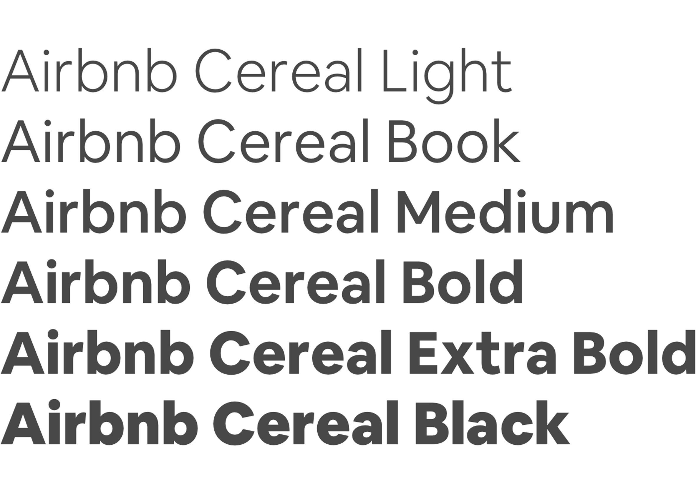
Using the strapline "From button to billboard", the brand launched the typeface yesterday with six weights including Light, Book, Medium, Bold, Extra Bold and Black.
Described as "playful, open, and simple", the typeface's distinguishing features include a taller x-height, which refers to the height of lowercase letters based on height of a lowercase x. Letters in the fonts also have slightly slanted open apertures, which can be seen in lowercase letters such as e and a.
The typeface is distinguished by a taller x-height and its open apertures
"Type can get pretty small in UI (user interface) design, and if the weight is too light the type can almost completely disappear," explained Karri Saarinen, Airbnb's design lead of design language systems. "So we paid special attention to the balance of the Book weight as to not be too light or too heavy."
"Lastly we toned down some of the characters so that they wouldn?t distract, but rather would be simple enough to allow people to complete tasks in the UI," he continued.
Airbnb's typeface is pa...
| -------------------------------- |
| PLINTO. Vocabulario arquitectónico. |
|
|

Villa M by Pierattelli Architetture Modernizes 1950s Florence Estate
31-10-2024 07:22 - (
Architecture )


