
Atkinson Hyperlegible typeface is designed for visually impaired readers
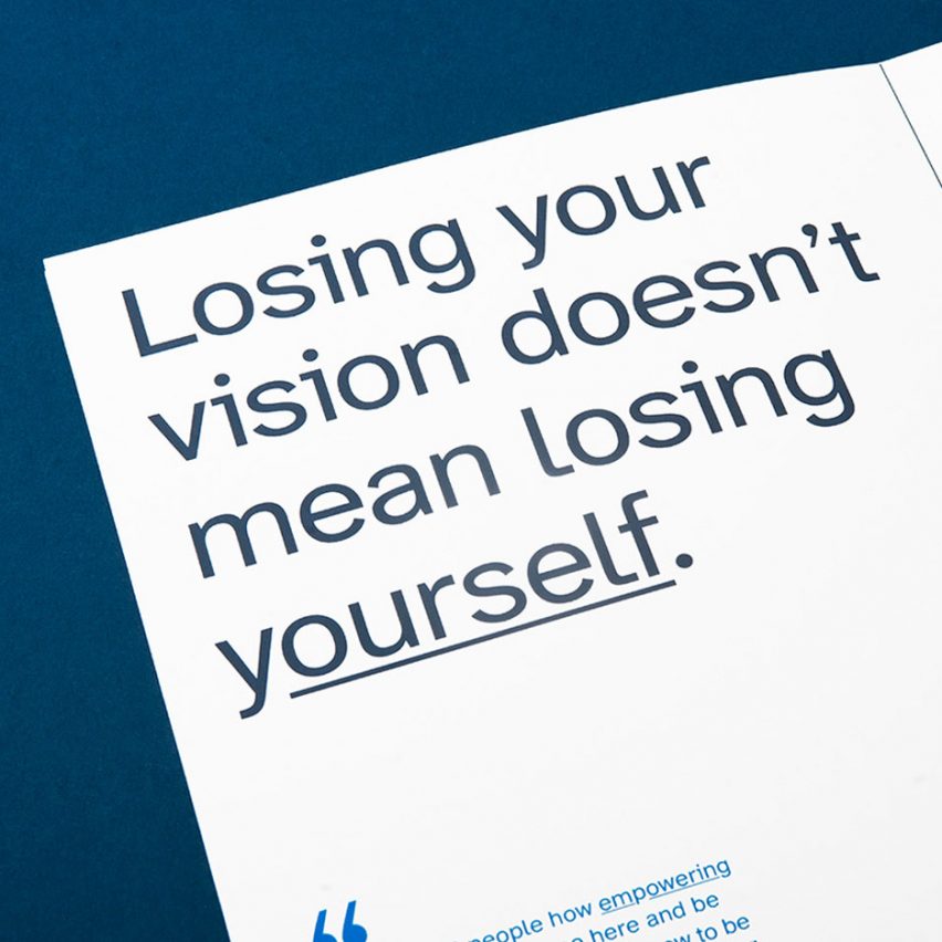
Graphic designer Applied Design Works has collaborated with the nonprofit organisation Braille Institute to develop a "hyperlegible typeface" for the visually impaired community.
The font family, which is named Atkinson Hyperlegible after Braille Institute founder Robert Atkinson, is composed of distinct and exaggerated letterforms crafted by Applied Design Works to increase character recognition and the readability of written content.
It is free of use by anyone who wants to make their own written materials widely accessible and can also be used for signage or to help people with good vision read quickly and accurately.
Atkinson Hyperlegible is a typeface for visually impaired people
Atkinson Hyperlegible was developed by Applied Design Works while creating a new visual identity for the Braille Institute to reflect a growing number of people around the world with vision impairment and the organisation's efforts to serve this community. However, during this process, Applied Design Works discovered that a typeface that mirrored this goal and met the needs of people with low vision did not exist.
It was made with the Braille Institute to have distinct and exaggerated letterforms
"There was no brief for the Atkinson Hyperlegible typeface, it was born simply out of a strong desire to improve the lives of people with low vision," explained Applied Design Works.
"The number of people who live with low vision is increasing at an incredible rate as people l...
| -------------------------------- |
| Live talk on circular design and technology with Dassault Systèmes | Dezeen |
|
|

Villa M by Pierattelli Architetture Modernizes 1950s Florence Estate
31-10-2024 07:22 - (
Architecture )


