Burberry unveils "archive-inspired" charging knight logo

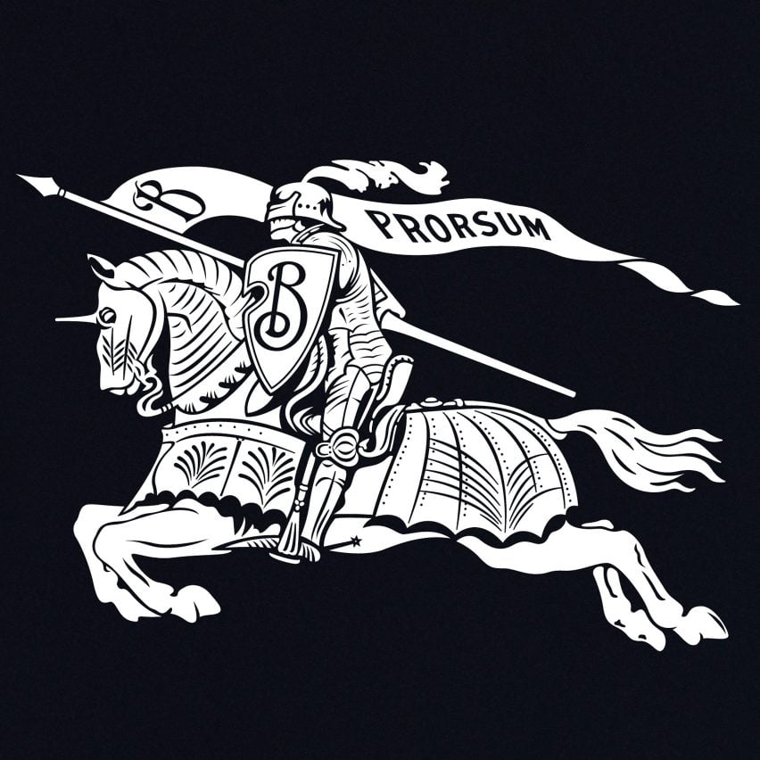
British heritage brand Burberry has unveiled a logo that uses an equestrian knight motif that was created for the brand over 100 years ago along with a serif typeface.
Campaign imagery adorned with the new logo, which was posted to Instagram earlier this week, announced the redesign as "the first creative expression" under the direction of new chief creative officer Daniel Lee.
It also used its Equestrian Knight Design
The campaign imagery followed after the brand wiped its profile of former imagery and content led by Lee's predecessor Italian fashion designer, Riccardo Tisci.
The rebrand includes a 122-year-old motif, titled Equestrian Knight Design, that was the winning entry of a public competition to design a new logo for the heritage brand in 1901. Burberry also reverted to a serif typeface
The Equestrian Knight Design is a motif that has been used throughout Burberry's history and takes shape as a horse-riding knight carrying a flag that is branded with the word "Prorsum" ? a Latin word that translates to forwards.
In a statement, Burberry explained that the new logo was informed by its history.
The logo is archive-inspired
"The new Burberry logo is archive-inspired," said the brand in a press release.
"The original Equestrian Knight Design was the winning entry of a public competition to design a new logo, circa 1901. The design features the Latin word 'Prorsum' meaning 'Forwards'."
Read: Peter Savi...
| -------------------------------- |
| INTERPRETACIÃN DE PLANOS. Detalles. |
|
|
Villa M by Pierattelli Architetture Modernizes 1950s Florence Estate
31-10-2024 07:22 - (
Architecture )
Kent Avenue Penthouse Merges Industrial and Minimalist Styles
31-10-2024 07:22 - (
Architecture )


