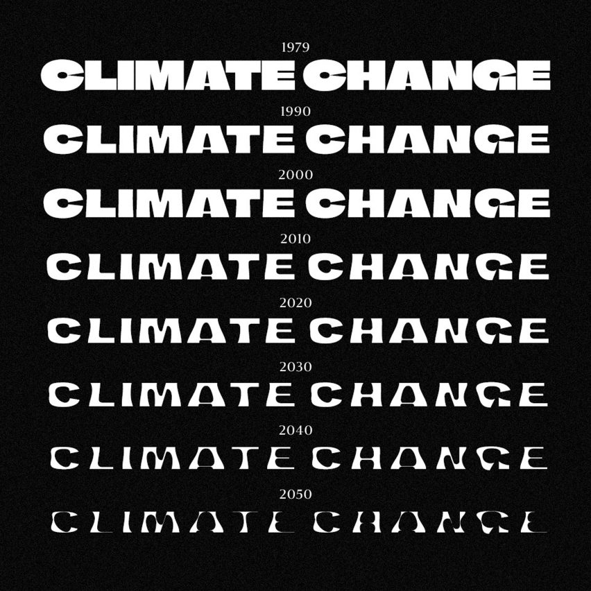
Climate Crisis Font visualises melting of polar ice based on real-world data

Finnish newspaper Helsingin Sanomat has developed a variable font that hopes to make the urgency of climate change tangible by mirroring the declining amount of Arctic sea ice in its disappearing letterforms.
While a regular typeface has certain pre-determined styles like bold or italic, the Climate Crisis Font allows users to adjust its font weight with the help of a sliding timescale.
The different weights of the Climate Crisis Font correspond to the amount of sea ice in the Arctic
This allows them to select any year between 1979Â when satellite measurements of Arctic ice first began and 2050, by which time it is expected to have shrunk by 30 per cent.
In 1979, the font, much like the ice, is at its thickest, with extra bold characters and what Helsingin Sanomat's art director Tuomas Jääskeläinen describes as "icy sharp edges". Users can change the weight on a sliding scale from 1979 to 2050
But as the years go by, the silhouette of the letters becomes ever more curved and thin as if they were melting away or sinking into the ocean.
The exact weight of the font at any point is based on historical data from the US National Snow and Ice Data Center (NSIDC), as well as future projections released by the Intergovernmental Panel on Climate Change (IPCC).
Helsingin Sanomat has already used the font to create a series of alarming posters
"A lot of attention to detail went into following the data with the font's weights," Jääskeläinen told Dezeen.
"...
| -------------------------------- |
| Dezeen Awards 2020 Interiors show | Dezeen Awards |
|
|
Villa M by Pierattelli Architetture Modernizes 1950s Florence Estate
31-10-2024 07:22 - (
Architecture )
Kent Avenue Penthouse Merges Industrial and Minimalist Styles
31-10-2024 07:22 - (
Architecture )


