Colourful circles denote contact-lens prescriptions in Dimple design by Universal Favourite
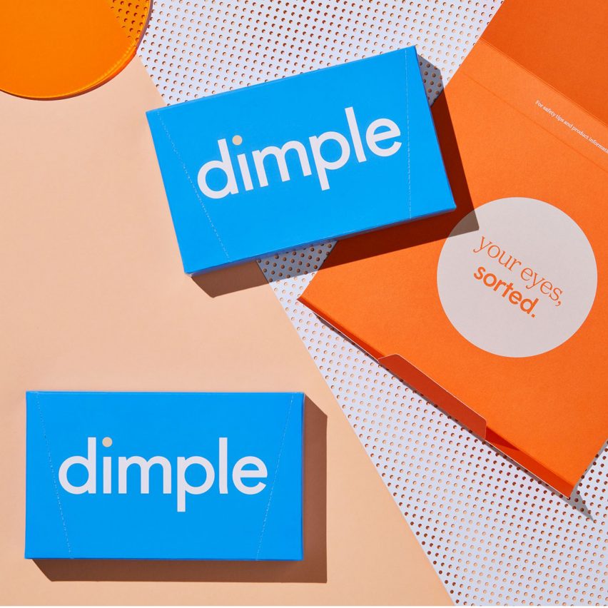
Australian studio Universal Favourite has designed the packaging for contact lens subscription service Dimple, which makes use of boldly patterned circles that correspond with prescriptions.
Dimple is a direct-to-consumer service that targets the millennial market. As such, the company needed branding that would stand out on social media and attract new customers ? without losing the serious appearance of a medical service.
For this reason, Universal Favourite based their design on a series of complementary circle graphics, each one denoting a particular contact-lens prescription.
Since most people need different levels of correction in each eye, their Dimple lenses will usually have different packaging for the left and right eye ? and the difference is bold enough that the user can see it without their lenses in. With power numbers ranging from -12.00 to +6.00 for Dimple prescriptions, Universal Favourite created 60 different circle graphics in a palette of blues, pinks, oranges, olive greens, teals and black.
The studio said that the advent of direct-to-consumer contact lenses had created the opportunity to completely rethink the product's packaging design.
"In Australia, four manufacturers control 97 per cent of the contact-lens market," said the studio.
"With this monopoly, there has been little to no effort required to brand their products. Packaging has always been designed with the optometrist in mind ? storable, stackable ? leaving a sea of white, c...
| -------------------------------- |
| Piazza Navona Painters |
|
|

Seven Hills SF: Feldman Architecture’s Airy Workspace Transformation
19-05-2024 08:40 - (
Architecture )