DesignStudio completes minimal rebrand for Deliveroo

Deliveroo has become the latest company to scrap its complicated logo in favour of a flat design, launching a pared-back rebrand by London agency DesignStudio (+ slideshow).
The food delivery company rolled out its new logo earlier today, alongside a blog post by founder Will Shu detailing the design process.
While the old logo features a cartoony kangaroo holding a shopping bag, the new one is more graphic and abstract.
It depicts a kangaroo's face in the form of a polygon with two eyes and two ears, though some have likened the design to a hand sticking up two fingers.
Related story: Airbnb rebrand by DesignStudio aims for visual consistency
Shu, who founded Deliveroo in 2012, explains that the new logo is still based around the same two aspects as the old one ? a kangaroo and the teal colour. "We explored a variety of routes for a new logo ? some that kept the kangaroo as its primary inspiration, to completely new logos that left our kangaroo roots behind," he said in the post.
"What we landed on was an evolution from our original and more literal take on the kangaroo, turning it into a striking new mark, bold and impactful."
The new motif will be adapted across the company's branded products, from its website to new delivery riders' uniforms.
DesignStudio, which previously headed up the rebrands for England's Premier League and home-rental website Airbnb, worked alongside Deliveroo's in-house design team to develop a new kit for...
| -------------------------------- |
| Future Luxury Retail Design Competition sought "exciting visions for the future" |
|
|
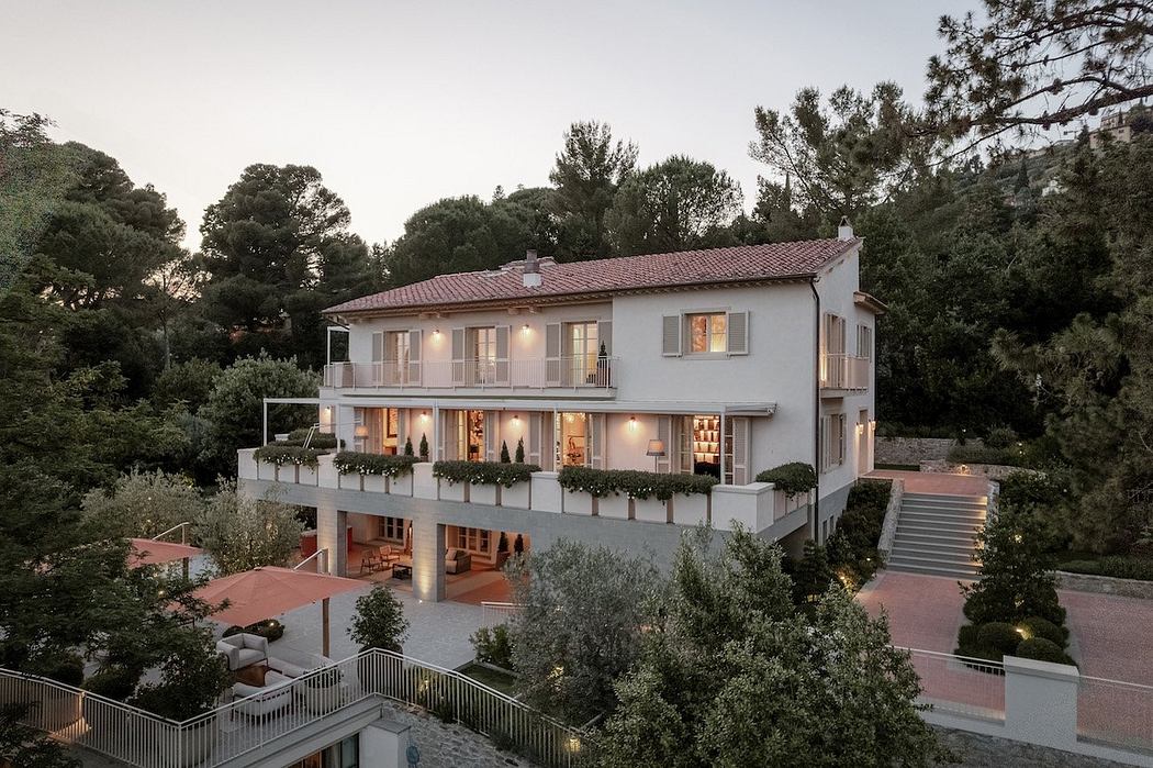
Villa M by Pierattelli Architetture Modernizes 1950s Florence Estate
31-10-2024 07:22 - (
Architecture )
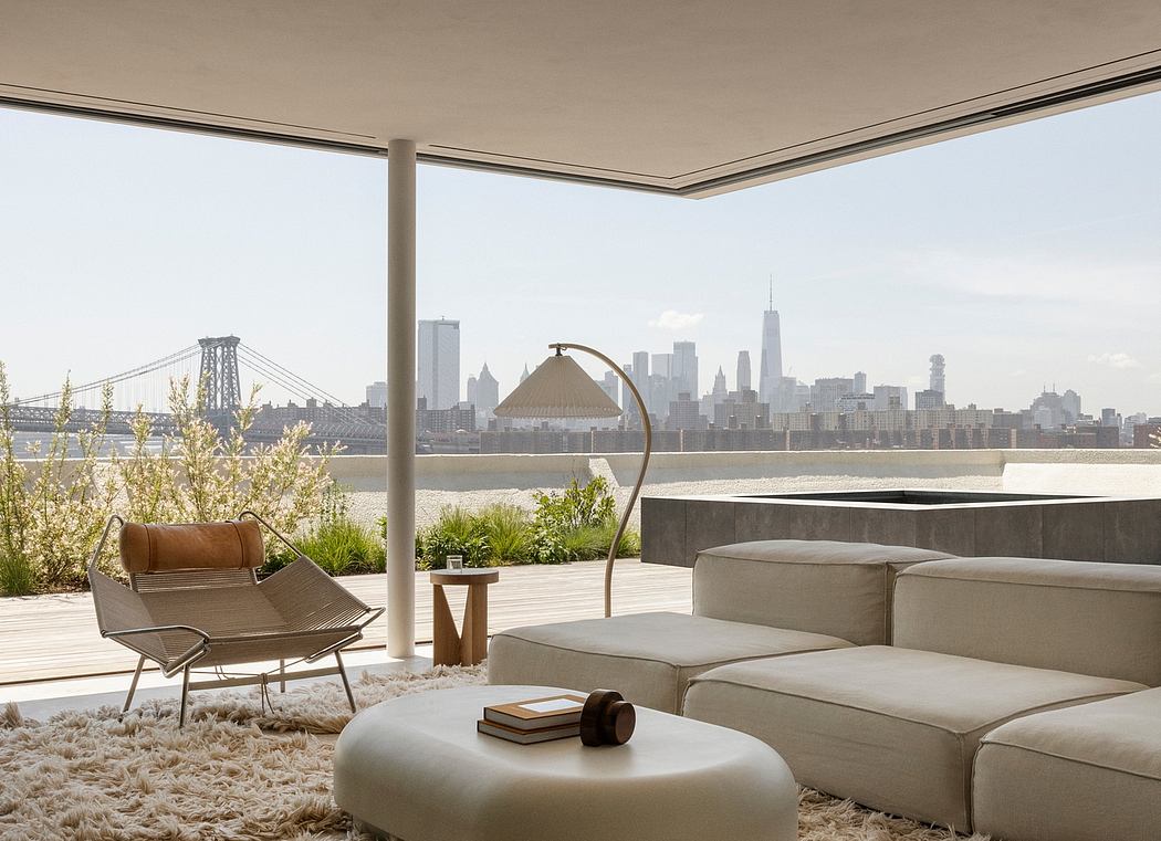
Kent Avenue Penthouse Merges Industrial and Minimalist Styles
31-10-2024 07:22 - (
Architecture )


