
Durex rebrands with flat logo and "sex positive" campaign
Creative agency Havas has designed a new brand identity for British condom manufacturer Durex, which features a flattened logo written in One Night Sans typeface in a bid to challenge "repressive" sexual norms.
Havas has designed the visual identity to accompany its updated brand strategy of showcasing the "positive reality" of sex.
The rebrand includes a refined logo and sans-serif typeface ? wittily named One Night Sans as a play on words of the term "one night stand" ? alongside posters advertising honest facts and figures about sexual health.
The new campaign aims to reposition the condom company as a "mainstream activist" against sexual stigmas and taboos.
"This might be the most important piece of work we ever do," said Elliot Harris, creative director at Havas. "Durex is a huge brand with a unique and vital role in culture. It has genuine influence, and the capability to enact real change. And make no mistake, this is a proper commitment."
"This new brand purpose will lead to healthier conversations around, and attitudes towards, sex, but also greater inclusion and acceptance for those who might not always experience it," he added.
"To have a brand like Durex publicly and proudly on your side makes a difference."
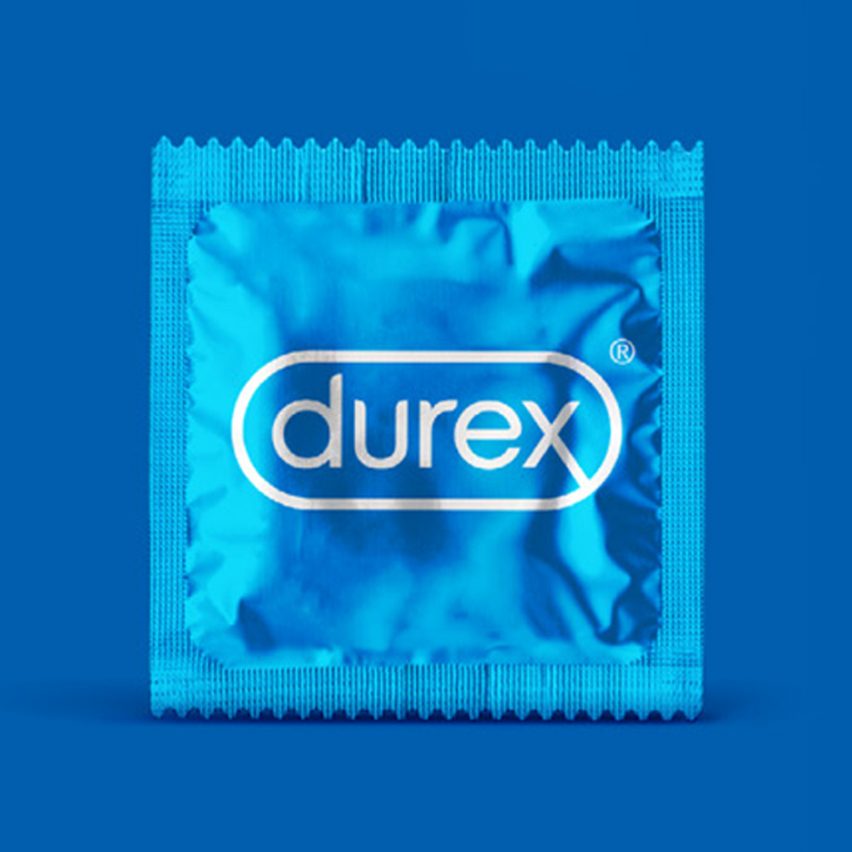
The former three-dimensional Durex logo featured a light-reflective effect, used to make the symbol look convex, encapsulated in a lozenge-shaped border.
The new emblem has do...
| -------------------------------- |
| PLANO TOPOGRÃFICO. Vocabulario arquitectónico. |
|
|

Villa M by Pierattelli Architetture Modernizes 1950s Florence Estate
31-10-2024 07:22 - (
Architecture )


