
Eurovision 2020 visual identity combines song contest participant's national flags
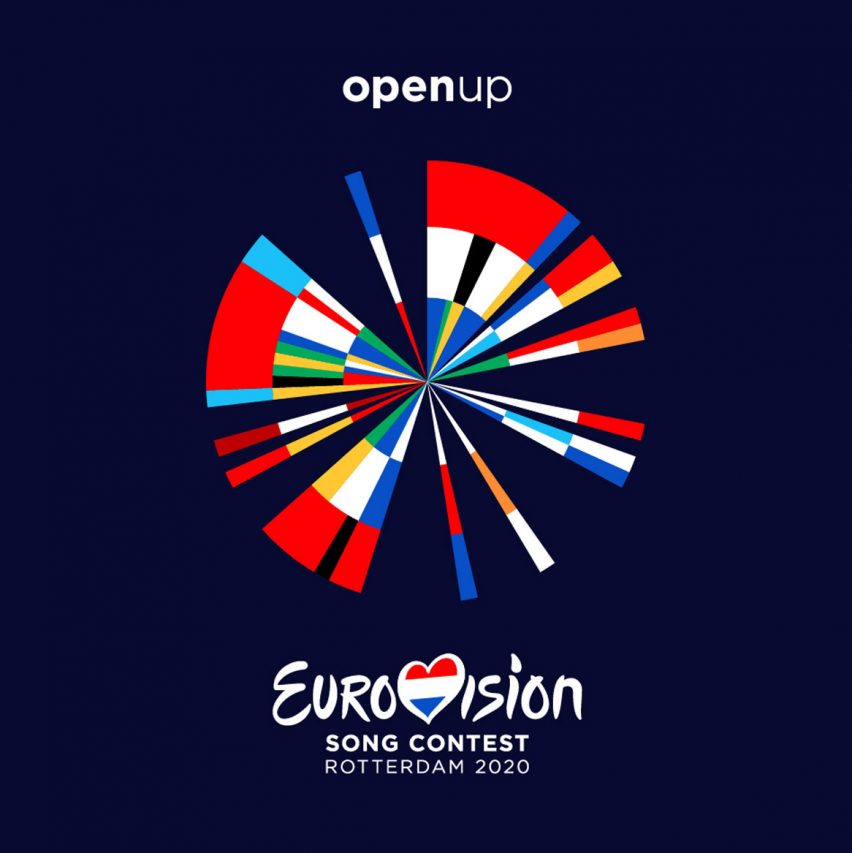
Design agency Clever Franke has created a logo for the Eurovision Song Contest 2020 that combines the flag and year that each of the 41 participating countries first competed.
The logo comprises a series of brightly coloured vectors emanating from the central point of a circle, like a sunburst.
It will be used during the televised Eurovision Song Contest 2020 event, which takes place in Rotterdam next year, as well as in advertising and on merchandise.
The design is a visual representation of the flags of all 41 countries that are participating in Eurovision in 2020.
Clever Franke took the colours of each country's flag, and used Processing and Illustrator software to add them clockwise in chronological order of first entry to the competition, to create a colourful abstract symbol.
"By using software that we've developed ourselves, along with historical data, we were able to design an iconic identity that brings the history of the Eurovision Song Contest to life in a truly unique way," said Thomas Clever, co-founder of Clever Franke.
The design was then "fine-tuned" by hand to make it a coherent design, as using all the colours from the flags did not immediately "create a holistic identity".
The years in no additional countries joining the Eurovision fold have been left blank, creating a gap in the colourful pinwheel.
For example there is a gap in the circle design from 1974 when Greece joined ? shown as a blue, white and blue segment to rep...
| -------------------------------- |
| Interview: Block9 reveals "monster" IICON stage at Glastonbury 2019 | Dezeen |
|
|

Villa M by Pierattelli Architetture Modernizes 1950s Florence Estate
31-10-2024 07:22 - (
Architecture )


