
Herman Miller unveils first rebrand in over two decades
New York design studio Order has created a nostalgic new brand identity for Herman Miller that harkens back to the mid-century modern heritage of the American design brand.
Last updated at the end of the 1990s, in the era of Web 1.0, the branding previously featured the "computer-friendly" FF Meta font and the company's enduring M logo from 1946, emblazoned on a red circle.
Herman Miller has received a rebrand courtesy of design studio Order
Tasked with bringing this identity into the 21st century while staying true to Herman Miller's legacy, Order took inspiration from the brand's own history ? specifically the modernist branding that was introduced by graphic designer John Massey in the late 1960s.
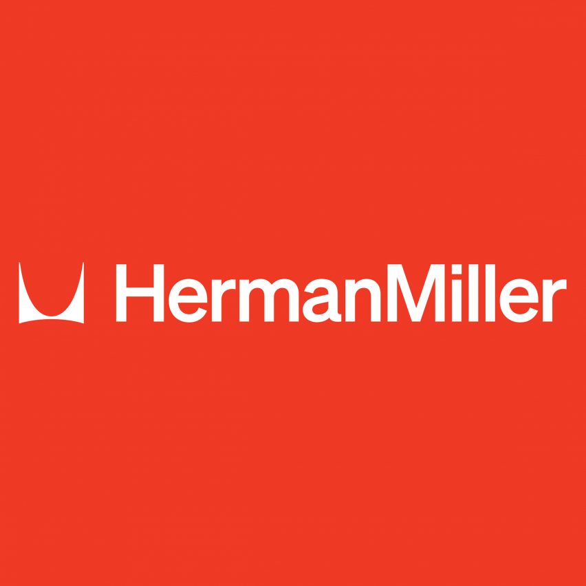
Much like this predecessor, the updated logo now features a Helvetica-style typeface, while the swooping M symbol was once again freed from the confines of its circular backdrop so it can be used as a graphic design element rather than just a trademark. The brand's identity was last overhauled in 1999
"The M symbol has stayed consistent through every iteration of the identity since Irving Harper drew it in 1946, so changing it was never an option," Order design director Garrett Corcoran told Dezeen.
"As we looked at its role over time, we saw early uses embraced it as both an identity mark and in the full visual language. However, in the 90s it evolved to the circle, which created some limitations around its use."
Herman Miller's wordmark is now re...
| -------------------------------- |
| AMO installs office chairs above tranquil garden at Prada menswear show | #Shorts | Dezeen |
|
|

Villa M by Pierattelli Architetture Modernizes 1950s Florence Estate
31-10-2024 07:22 - (
Architecture )


