House of van Schneider designs minimal logo for NASA's Mars mission

Design studio House of van Schneider has created a visual identity for NASA's Mars 2020 mission, which condenses the red planet, the Earth and the rover into three simple, flat shapes.
Designed to capture "the energy and legacy of space travel", the logo and branding was created to mark the launch of NASA's Perseverance robotic rover, which was sent to Mars on 30 July to find evidence of past life on the planet.
House of van Schneider's logomark is made up of three parts, including a red colour-block circle, which symbolises Mars, and a white geometric form made up of unevenly stacked blocks, designed to stand for the Mars rover.
The third element is a white star, meant to represent what the Earth would look like from the red planet.
The Brooklyn-based studio wanted the emblem to be able to work just as well on the rover itself as it would on the 191-foot-tall (approximately 58-metres-tall) rocket ship.
The logo's simple, flat design ensures that it can be applied in all sizes across digital platforms as well as physical formats without compromising the clarity.
It is also featured on NASA products like badges and key cards, for instance, the latter of which are printed with a simplified, embossed version of the logo without its circular backdrop.
"Last year, a fairly well known space company reached out and asked us to design a logo for the Mars 2020 mission. Naturally, we complied," said founder Tobias van Schneider in an Instagram post.
"We ne...
| -------------------------------- |
| Teddy Schuyers? Guts redesigns ostomy bag for sex, sport and everyday life |
|
|
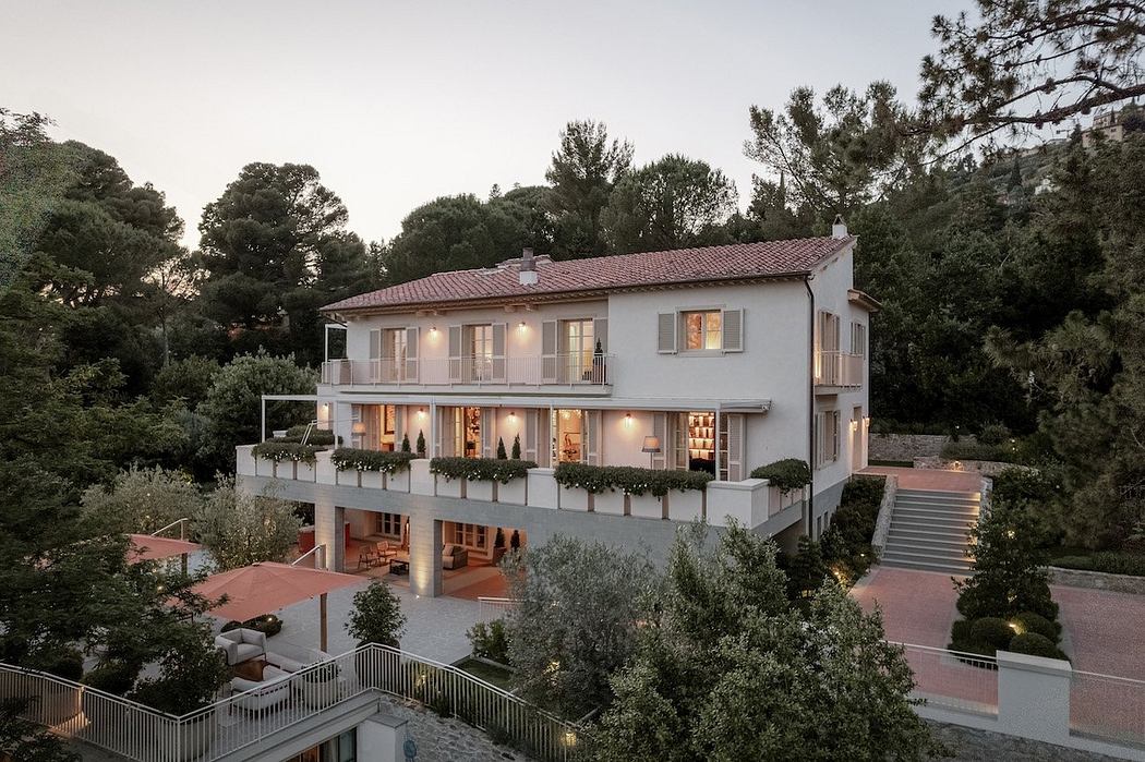
Villa M by Pierattelli Architetture Modernizes 1950s Florence Estate
31-10-2024 07:22 - (
Architecture )
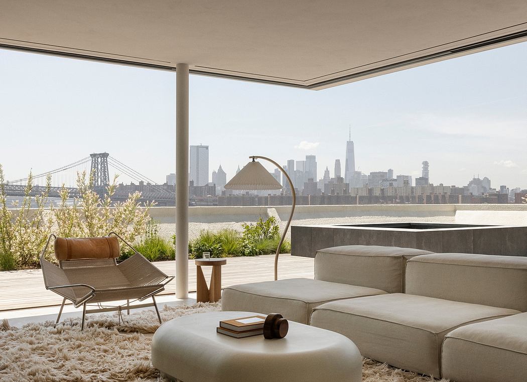
Kent Avenue Penthouse Merges Industrial and Minimalist Styles
31-10-2024 07:22 - (
Architecture )


