IKEA's iconic blue and yellow logo made "future proof" in subtle redesign by Seventy Agency

Swedish furniture giant IKEA has unveiled an updated logo, although the changes will only be spotted by those with a keen eye for detail.
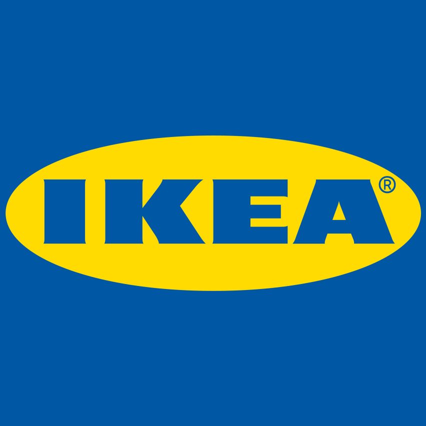
Stockholm brand agency Seventy Agency developed the new identity, in its first redesign since 1983. It sees the blue block letters of the iconic IKEA logo subtly enlarged to snugly fill the edges of its surrounding yellow oval.
The brief given to the designers was to increase readability both in a digital and physical format, and across a range of sizes. The challenge was to achieve these criteria without needing a re-registration of the trademark.
This gif, also by Brand New, shows how the trademark symbol has been moved
"We have updated the IKEA logo to future proof it in a digital world," said IKEA. "It is a small change that is more of a refinement to secure it is easy to recognise, at all times." "The IKEA logo has basically looked the same since mid-60s, while shopping patterns and media consumptions have changed," the company added. "This puts new demands on functionality of logotypes in general."
"The updated IKEA blue and yellow colours will take on a larger branding role, aiding the experience of IKEA in current and new meeting points," added Seventy Agency.
"The new colours make it easier to reproduce the logo more consistently," it continued. "They are now optically enhanced, optimised for individual colour experiences, even when they are not sitting next t...
| -------------------------------- |
| Bang & Olufsen launches TV that can be folded away to "reduce its visual presence" |
|
|
Villa M by Pierattelli Architetture Modernizes 1950s Florence Estate
31-10-2024 07:22 - (
Architecture )
Kent Avenue Penthouse Merges Industrial and Minimalist Styles
31-10-2024 07:22 - (
Architecture )


