Instagram scraps retro logo for more "modern" design

Mobile photo-sharing app Instagram has ditched its iconic retro-camera logo in favour of a simple illustration set against a multicoloured gradient.
The new logo was introduced today, along with a pared-back, black-and-white interface and a corresponding set of buttons for Instagram's Layout, Boomerang and Hyperlapse apps.
The photo-sharing app ditched its iconic retro camera logo in favour of a simple illustration set against a multicoloured gradient
In order to make images and videos stand out, the interface is flatter and less colourful, with white and grey replacing its signature blue.
Notifications now appear in pink instead of orange, and toolbar icons are simplified to an outline, which turns black when selected.
Instagram's design team created a more "modern" app icon that still features the view finder and lense from the original logo In a blog post, design director Ian Spalter said the company, which was founded in 2010, had been considering a redesign since last year.
"Last year, a group of us started digging into how we could support [the app's] evolution while staying true to Instagram's heritage and spirit," he said. "We wanted to create a look that would represent the community's full range of expression???past, present and future."
The design team began by flattening the existing retro-looking camera icon, which they believed was "no longer reflective of the community".
Related story: Google's desi...
| -------------------------------- |
| BBC's Tokyo 2020 trailer "brings the Olympics into everyday Japan" |
|
|
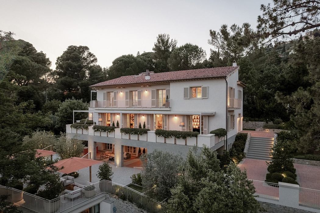
Villa M by Pierattelli Architetture Modernizes 1950s Florence Estate
31-10-2024 07:22 - (
Architecture )
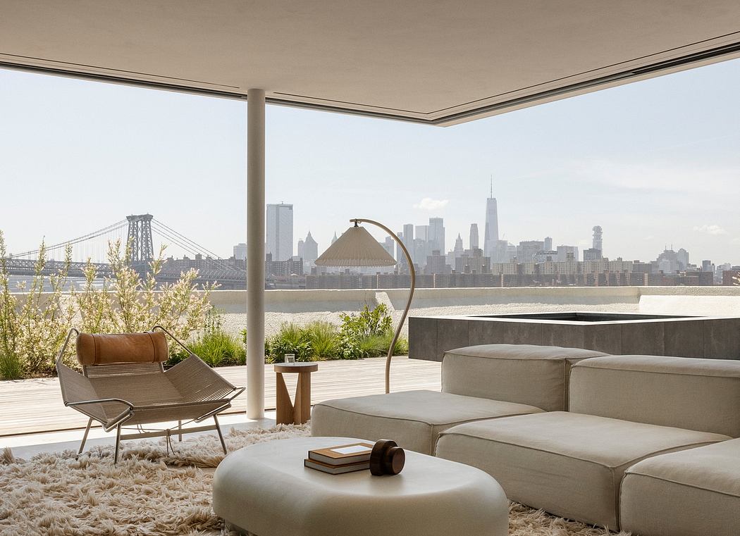
Kent Avenue Penthouse Merges Industrial and Minimalist Styles
31-10-2024 07:22 - (
Architecture )


