
Johnson Banks creates meat alternative packaging that isn't "preachy"
London design studio Johnson Banks has created a visual identity for new meat alternative brand This, aimed at flexitarians wanting to reduce their animal consumption.
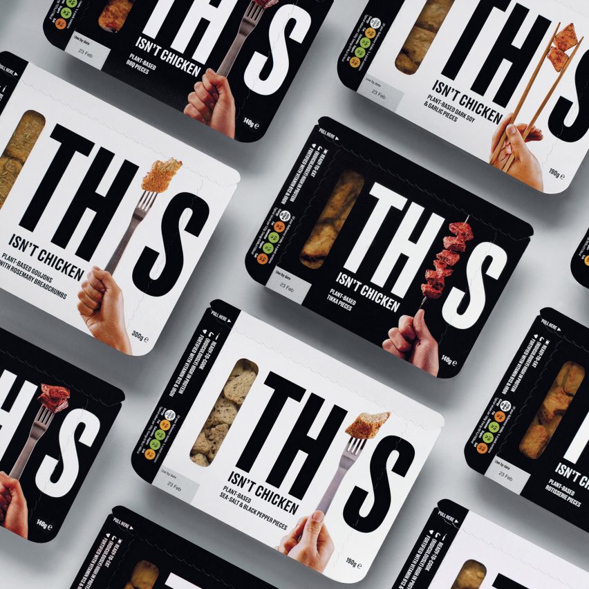
The plant-based brand ? which will be released in the UK later this year ? offers a selection of soy and pea-based products made to resemble the taste and appearance of several types of meat, such as chicken, pork and beef.
The visual identity has a largely monochrome palette with the brand name printed in a sans serif, all-caps font.
Each of the eight packaging designs feature forks, skewers, knives or chopsticks holding various meats in the place of the "I" in This.
Keen to appeal to those who still eat meat but want to reduce their consumption, rather than stopping altogether, the team chose to avoid the "preachy" language associated with the vegan and free-from food market. They opted for a visual language that utilises the appeal of meat as a selling point, instead of "guilt-tripping" people into modifying their eating habits.
"Our branding challenge was to help create and launch a disruptive, challenger brand into a market mainly aimed at vegetarians, dominated by major brands such as Quorn," said Johnson Banks.
"Instead of guilt-tripping people into changing their diet, they wanted to tempt people by harnessing the irresistible smell of bacon and satisfying texture of chicken," explained the studio.
The bold packaging is made of cardboard where the ...
| -------------------------------- |
| Nikolas Bentel designs shirts that react to changes in pollution |
|
|

Villa M by Pierattelli Architetture Modernizes 1950s Florence Estate
31-10-2024 07:22 - (
Architecture )


