
Jonas Wagell's minimal Bold clock is based on typographic shapes
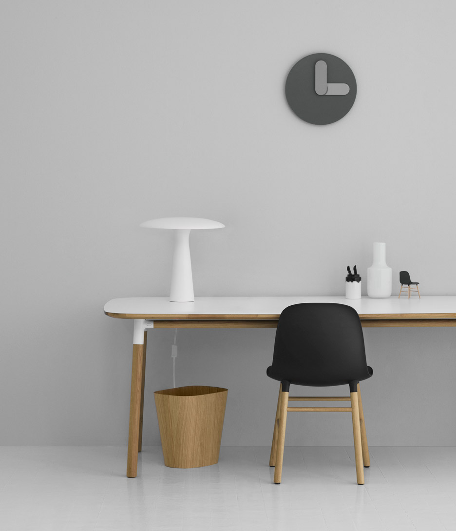
Swedish designer Jonas Wagell used his background in graphics to create a clock with chunky hands.
Bold clock has just been launched by furniture brand Normann Copenhagen, but was originally designed by Wagell in 2008 while working on an interiors project.
"I was looking for a clock with very simple and graphic expression and couldn't find anything that looked nice enough to that description," Wagell told Dezeen. "If you can't find it ? design it."
The clock takes its name from the bold weight that typefaces can be set in, and features chubby sausage-shaped hands similar to the shapes used in a rounded serif typeface. Wagell studied graphic design and typography before launching his Stockholm product design studio JWDA.
"I wanted the hands of the clock to be wide and bold, which is unusual for clocks," said the designer, who has also created a sofa range for the Danish brand.
Related story: Rachel Suming's Eclipse clock tells the time without hands
"I used Helvetica Rounded frequently at this time, and this may well have inspired the form," he added. "I think my graphic background has taught me to appreciate simplistic and clear form."
A curved section of the hours hand echoes the colour of the minimal, number-free face, creating an optical illusion that the hands are hovering.
The clock is available in white, grey, and dark green, with black, grey, and pink and green hands respectively. The pr...
| -------------------------------- |
| VOLUMEN DE UN CILINDRO. GeometrÃa descriptiva. |
|
|

Villa M by Pierattelli Architetture Modernizes 1950s Florence Estate
31-10-2024 07:22 - (
Architecture )


