Juventus FC faces fan uprising after launching minimal new logo

Italian football club Juventus has unveiled its new crest, but the team's fans think the minimalist rebrand is an own goal.
Turin-based Juventus, sometimes dubbed Juve, is the current league champion and widely considered one of the most successful football clubs in the world.
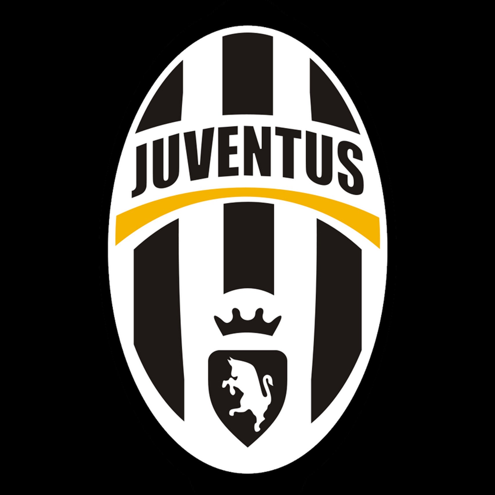
Its existing logo features the silhouette of a charging bull, as well as a crown, bold black and white stripes, and the team name underlined in yellow.
For the stark redesign, Juventus, working with design agency Interbrand, discarded most of these elements. Instead, they brought in two J-like stripes that hang beneath the team name, which is spelt out in distinctive lettering.
The new visual identity, titled Black and White and More, is intended to help the brand grow in presence as the club explores new business initiatives less directly related to football. However, club fans were quick to disparage the rebrand on social media. Some complained the new logo is too anonymous and corporate.
Juventus have unveiled their new badge, which is a tribute to the JD Sports logo. They just love their big brand sales. pic.twitter.com/oeATZTVFjK
? Paddy Power (@paddypower) January 17, 2017
"The new logo tells me this is the Juventus brand and we are customers, not fans," wrote user @JuventusCrazy.
Some felt it resembled a pattern someone might shave into their facial hair.
The new Juventus logo was clearly based on Alessandro Del Piero!
Via @FootballRamble pic.twitter.com/10qMKyAtXd
? 101 Great...
| -------------------------------- |
| Reptilian humanoids feature in work by artist Pauline Rip |
|
|
Villa M by Pierattelli Architetture Modernizes 1950s Florence Estate
31-10-2024 07:22 - (
Architecture )
Kent Avenue Penthouse Merges Industrial and Minimalist Styles
31-10-2024 07:22 - (
Architecture )


