
Matchstic reworks Atlanta's zoning signs to make them more readable
Brand identity firm Matchstic has worked with Atlanta's Department of City Planning to redesign its branding and create new zoning signs around the city.
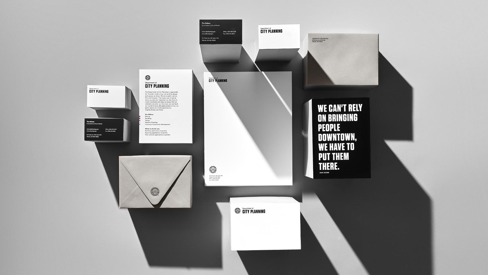
Speaking about the department's initial rebrand, Matchstic explained, "We worked with [Tim Keane, Commissioner of City Planning] and his core team to uncover why the department exists and what they hope to accomplish."
"Atlanta's Department of Planning and Community Development has a lot to say to a lot of people, but the messages aren't always clear," it continued. "The challenge was to design a system within the longstanding city brand, including a seal that's been around since the 19th century."
Keeping the original seal, the new identity features bold practical typography and focuses more on utility than ornamentation. As well as creating a new visual identity, Matchstic were also responsible for "humanising" the language used by the department, so that it could communicate with the public more clearly.
Within the department's offices, the studio helped implement new wayfinding standards, which included adding signage to clearly direct people through the permitting and approval process. Here, the studio implemented emotional colour theory in order to differentiate the offices within the department.
"The colours were refined to reflect what our flourishing city represents, boldly framing each sign, no matter its backdrop."
As well as the bold colours, the notices h...
| -------------------------------- |
| Aldora sofa by Cristina Celestino for Moooi | Dezeen |
|
|

Villa M by Pierattelli Architetture Modernizes 1950s Florence Estate
31-10-2024 07:22 - (
Architecture )


