Mozilla reveals new logo developed through open design process

After seven months of public scrutiny, London studio Johnson Banks has revealed the new Mozilla logo it created through an open design process.
The rebranding process for Mozilla, the software community best known for developing the Firefox browser, began in June 2016.
Prompted by Mozilla, which prides itself on its open-source approach, Johnson Banks carried out the rebranding project "in the open", setting up a blog through which it shared ideas and invited feedback.
The final logo closely resembles one of November's final four concept designs, Protocol, which references coding language and style.
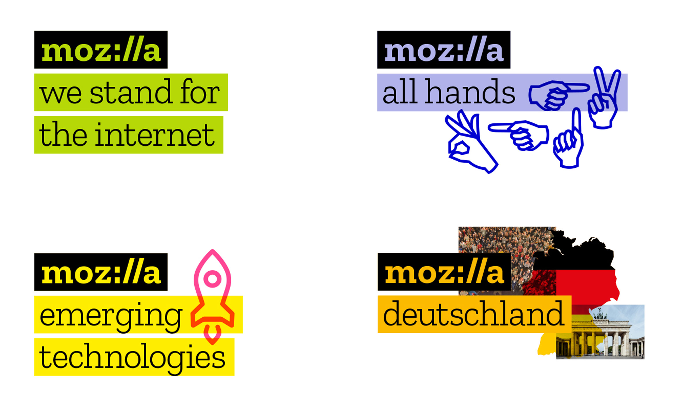
It features the company name spelled out in a Courier-like font, with the "I" and "L"s represented by a colon and two forward slashes ? as would appear after the HTTPÂ in a URL.
"Our logo, with its nod to URL, language reinforces that the internet is at the heart of Mozilla," said the company's creative director Tim Murray.
"We are committed to the original intent of the link as the beginning of an unfiltered, unmediated experience into the rich content of the internet."
The flat design ? bolder than Mozilla's previous plain wordmark ? also borrows elements from the other concept designs.
The "openness" prioritised in the design process carries through to other aspects of the finished identity. The Zilla font, by Dutch type foundry Typotheque, is being made available for use for free.
Mozilla also plans to invite...
| -------------------------------- |
| MAD models "futuristic" cruise terminal in China on gantry cranes |
|
|
Villa M by Pierattelli Architetture Modernizes 1950s Florence Estate
31-10-2024 07:22 - (
Architecture )
Kent Avenue Penthouse Merges Industrial and Minimalist Styles
31-10-2024 07:22 - (
Architecture )


