
New York Times redesigns website to catch up with mobile offering
The New York Times has subtly reimagined its webpage to better reflect the way its digital subscribers consume news online.
The newspaper has updated both the user experience and the speed of the site to create a uniform branding for readers accessing news across all different digital platforms.
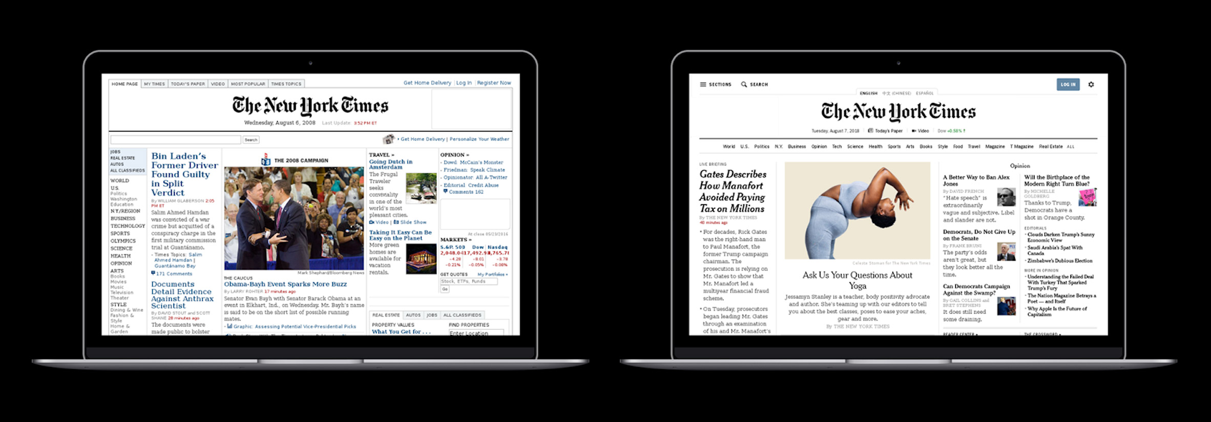
The New York Times' previous design (left) has been updated (right) to align with its mobile offering
The comments section now runs parallel to the article. The site also supports right to left page-turning for moving between stories, which mimics the way you read a physical paper.
Articles can now be read with a single scroll, rather than clicking through pages to continue. A scrolling horizontal bar at the top of the page leads readers to more stories in the section that they're reading. A "section" button in the top left-hand corner of the page, allows readers to switch between areas of the paper that the user is interested in. Each page also now has a "share" button.
Although the format of stories, the platforms that the website supports and the way readers navigate have all changed rapidly over the last decade, the overall design of the website had remained largely the same.
Print copies of potential webpages were analysed during the redesign process
Until now the paper had focused on making the mobile apps easy to use and visually pleasing, with a full overhaul in October 2017. But the website had taken a backseat.
"We've invested heavily in making our...
| -------------------------------- |
| Caruso St John wins Stirling Prize 2016 for Damien Hirst?s Newport Street Gallery |
|
|

Villa M by Pierattelli Architetture Modernizes 1950s Florence Estate
31-10-2024 07:22 - (
Architecture )


