
OlssønBarbieri plays with Bordeaux wine rules in Château Picoron rebrand
To reflect the restrictive winemaking regulations in the French region of Bordeaux, Norwegian studio OlssønBarbieri set itself constraints when coming up with a playful brand identity and packaging design for the winery Château Picoron.
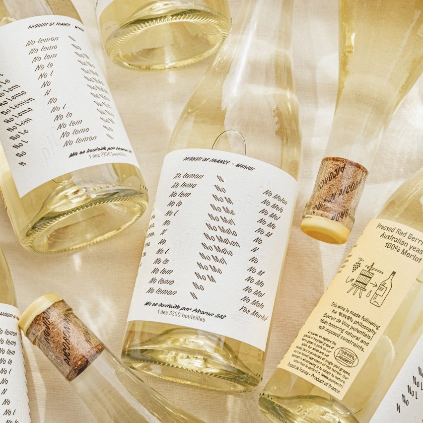
Established in 1570, Château Picoron was recently bought by an Australian family who wanted to change everything about the brand identity but the name. They wanted the graphic design to break with the traditions of Bordeaux, while also bringing up issues of climate change and the region's future.
"Home to some of the world's most prestigious wines and strictest self-imposed regulations, Bordeaux has begun to lose its appeal to new generations," said OlssønBarbieri. "The goal was to create an inclusive brand identity by shaking the snobbery of the region, making wines more fun while honouring their legacy." OlssønBarbieri used self-imposed constraints in its graphic design
To meet this challenge, OlssønBarbieri decided to reference the strict rules that winemakers need to meet to use the Bordeaux appellation ? such as using particular grapes, harvesting methods and length of maturation ? by imposing some of its own constraints on the design, which has been shortlisted in the graphic design category of Dezeen Awards 2022.
Firstly, the team used only one font: Bourrasque by the French type foundry Bureau Brut. OlssønBarbieri picked it because it can slant 45 degrees in both directions, giving the studio ample room to ...
| -------------------------------- |
| Musician's Mirror uses instant feedback to alert performers to bad posture |
|
|

Villa M by Pierattelli Architetture Modernizes 1950s Florence Estate
31-10-2024 07:22 - (
Architecture )


