
Pentagram creates Flight Center font for hotel in Eero Saarinen's JFK airport terminal
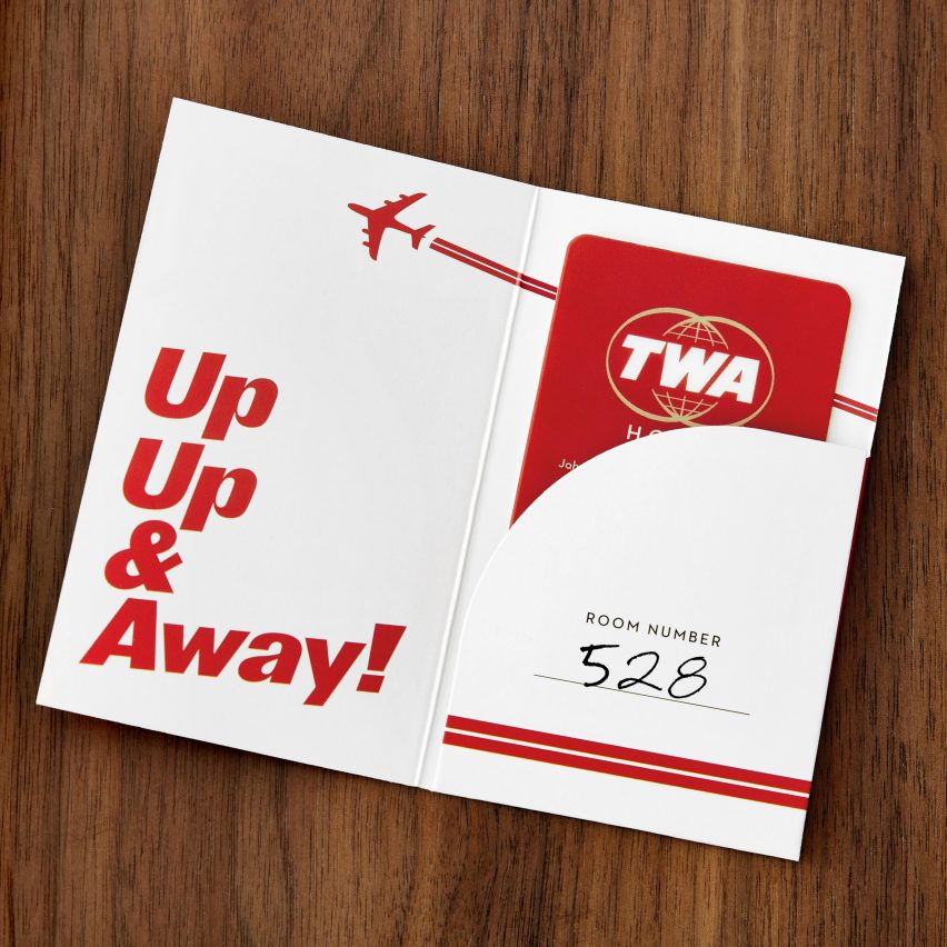
Lettering used in Eero Saarinen's 1960s TWA Flight Center at John F Kennedy International Airport in New York provided the cues for the branding of the new hotel in the terminal building.
Graphic design firm Pentagram was enlisted to create the new typeface for the TWA Hotel at JFK in Queens, New York City, which is slated to open 15 May following an extensive renovation of the old terminal.
Called Flight Center Gothic, the new typeface was based on the branding and wayfinding that Finnish-American architect Saarinen designed for the airport building when it opened in 1962.
Photography by Max Touhey
"His graphic design was one of the elements that was discussed the most," Pentagram partner Michael Bierut, who led the project, told Dezeen. "It [was] very visible when we toured the then closed Terminal." "There was a remarkable amount of consistency of all original signs that were still there many of which were still intact at all and all those dated in the early 1960s," he continued.
The typeface comprises thick line weights and exaggerated italics that are intended to evoke the motion of flight. Curving details, meanwhile, are intended to reference the futuristic architectural elements found in the terminal building, like the wing shaped exterior, and draw on the original lettering.
...
| -------------------------------- |
| Grimshaw models Shenzhen airport transport hub on mangrove trees |
|
|

Villa M by Pierattelli Architetture Modernizes 1950s Florence Estate
31-10-2024 07:22 - (
Architecture )


