
Pentagram "future-proofs" Thames & Hudson with latest rebrand
Pentagram has designed a fresh visual identity for publishing house Thames & Hudson that is "part modernisation and part restoration".
Design agency Pentagram was tasked with creating new branding for the British publisher that would establish it as a "forward-thinking" global company while still honouring its 70 year-long history.
Pentagram has "modernised" Thames & Hudson's logo
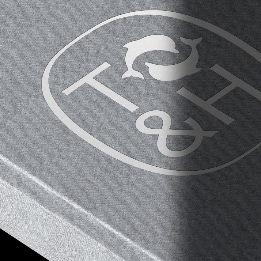
After researching how the Thames & Hudson logo had been reworked in previous iterations, the designers created a new wordmark and a modernised version of its original cartouche from when it was founded in 1949.
This initial branding was informed by two dolphins swimming east to west respectively, to reflect the company's heritage ? as it takes its name from the primary rivers in London, the Thames, and New York, the Hudson. The rebrand draws from an original mosaic found in the Thames & Hudson offices
The redesigned cartouche encases a T&H monogram that has been printed in a bespoke logotype typography, accompanied by the publisher's existing dolphin emblem, which sits at the top right-hand corner.
Pentagram opted for a "neutral yet sophisticated" colour palette of icy greens and blues and warmer grey tones, inspired by an original mosaic at the Thames & Hudson office in London.
The rebrand features a neutral and cool colour palette
"This new identity is part modernisation and part restoration of the brand", said Harry Pearc...
| -------------------------------- |
| Herman Miller unveils first rebrand in over three decades |
|
|

Villa M by Pierattelli Architetture Modernizes 1950s Florence Estate
31-10-2024 07:22 - (
Architecture )


