
Peugeot removes lion's body from logo for first time in almost 50 years
French car brand Peugeot has unveiled a redesigned logo, featuring a lion's head that recalls its 1960s emblem, as part of a rebrand to mark a new era of electric car manufacturing.
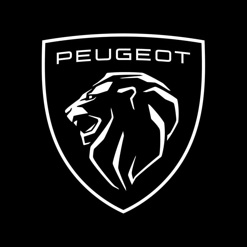
The carmaker, which describes itself as the world's oldest surviving automotive brand, updated its logo for the first time in 10 years. It is the 11th logo update in its history.
As with every version of its logo since 1847, the lion is central to the new design, which was created by Peugeot Design Lab.
However, unlike the previous logo, the design does not include the lion's body. Instead, it only includes a stylised head and mane placed under the car brand's name within a shield.
Peugeot's updated logo features a stylised lion's head
This design appears to be a redesign of the logo used throughout the 1960s, which also featured a lion's head within a shield. This marks the first time since 1975 that the lion's body has been removed from Peugeot's logo. For the past 46 years, the logo has shown the lion standing on its two hind legs with its forelegs raised in the air.
Peugeot has used a logo featuring a standing lion since 1975
The brand introduced the redesigned logo to mark the company's transition towards producing electric cars.
According to Peugeot, it will offer an electrified variant of every one of its models by 2025.
The logo recalls Peugeot's 1960s logo
"A new logo and brand identity are significant developments for any marque, let alone Peugeot, who has a history spanni...
| -------------------------------- |
| Fast Sketch - Cube Deconstruction - Basic Design Elements #2 |
|
|

Villa M by Pierattelli Architetture Modernizes 1950s Florence Estate
31-10-2024 07:22 - (
Architecture )


