
Russian tourist board unveils new visual identity inspired by suprematist art
A team of five designers has created a new brand identity for Russia's tourist board, which references the graphic style of suprematist artworks.
The design was created following an open competition launched by the Federal Agency for Tourism of the Russian Federation and the Association of Branding Companies of Russia, for a new visual identity to promote tourism in the country.
The winning identity and its slogan "the whole world within Russia" was created by a team of designers from four different Russian agencies: Supremtica, Plenum, Artonika and Art.Lebedev.
Suprematism, the avant-garde art movement developed by Russian artist Kasimir Malevich, formed the starting point for the design.
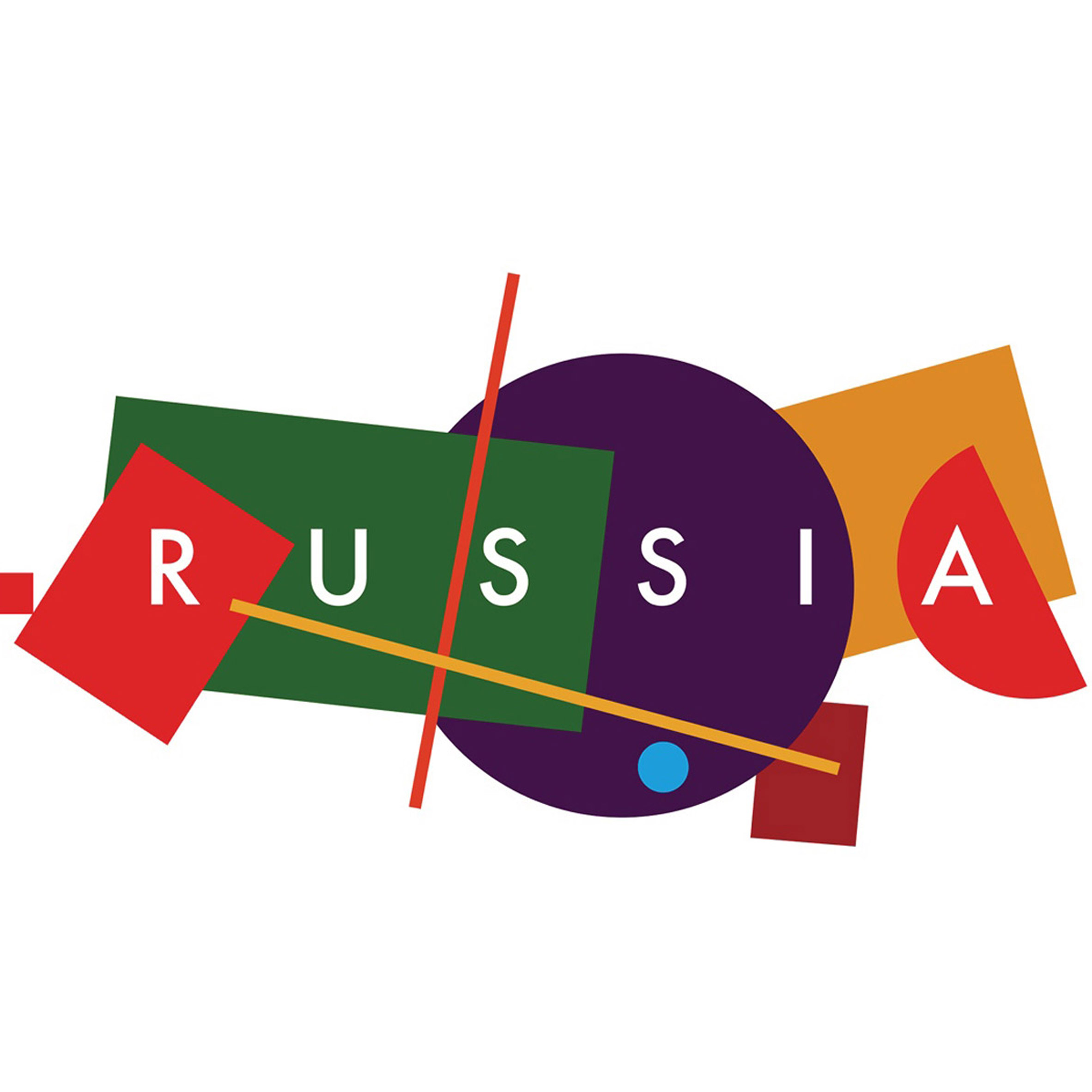
It led the designers to develop a logo made of up basic geometric shapes, which loosely form a map of Russia. Each of the 10 shapes represents a different place and territory, and they are presented in block colours of red, green, purple and orange. Interestingly, it includes Crimea ? a former part of Russia that was annexed in 2014. This territory is presented as a small square on the far left of the image.
"This is a pretty simple graphic approach that shows the country's diversity ? sometimes complicated and bulked, sometimes totally empty, like an incoherent patchwork quilt," said Vladimir Lifanov, who is creative director of Supremtica.
"This concept is a good example of how anyone can express his perception of a homeland," he continued. "Th...
| -------------------------------- |
| Visitors try out the carpet slide plus more highlights from Tuesday morning at IKEA Festival |
|
|

Villa M by Pierattelli Architetture Modernizes 1950s Florence Estate
31-10-2024 07:22 - (
Architecture )


