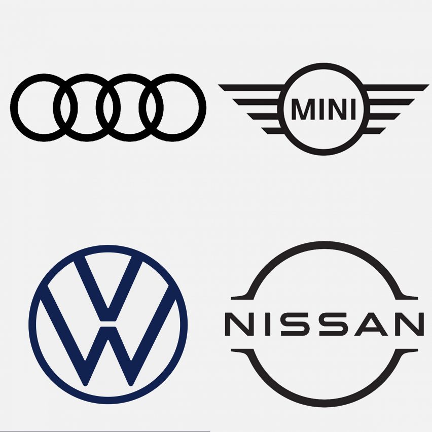
Seven car brands that have returned to flat logo designs

After rebranding with three-dimensional, chrome-effect logos in the 80s and 90s, carmakers from Nissan to BMW are reverting back to flat designs to keep pace with the digitally led world. We've rounded up seven examples.
Simplified, flat logos replicate better on screens and in miniature as app icons, prompting designers to ditch the three-dimensional (3D) logos that were popular among automotive companies in the 1980s and 90s.
These logos had shiny chrome-effects that mimicked how the emblem would look like in metal as a car mascot. This style, called skeuomorphism, has fallen out of favour since Apple began to prioritise flat design in its software updates.
Car brands are now reverting back to mid-century style flat design for their logos in an attempt to better align themselves with the style set by the tech company. Changing back to two-dimensional (2D) logos is also a way to offer better readability on digital platforms.
"With the advent of digital brand touchpoints and especially small mobile screens, all those fiddly bevels and gradients meant the logos became little grey smudges, indistinguishable from one another," explained Dan Beckett, lead designer of Toyota's latest logo.
"I don't see [flat design] as a new trend," Beckett added. "I see it as the logical solution to a universal problem created by a different trend."
Read on for our selection of seven car brands that have recently rebranded with flat design:
MINI
MINI was one of ...
| -------------------------------- |
| ÃREA DE UN SEGMENTO CIRCULAR. Tutoriales de arquitectura. |
|
|
Villa M by Pierattelli Architetture Modernizes 1950s Florence Estate
31-10-2024 07:22 - (
Architecture )
Kent Avenue Penthouse Merges Industrial and Minimalist Styles
31-10-2024 07:22 - (
Architecture )


