Seven of the most effective Minimalist rebrands

Brands have been scrapping their previously complicated logos in favour of flat designs that can be recognised in a heartbeat. We've rounded up seven of our favourite minimal redesigns from the last few years, including simplified lions, sans-serif icons and a "responsive W" (+ slideshow).
UK Premier League 2016 rebrand by DesignStudio
England's primary professional football competition kicked off its 2016/2017 season with a significantly more minimal lion's head logo.
London- and San Francisco-based agency DesignStudio evolved the Premier League's traditional lion logo, created for its founding in 1992, into a more stripped-back form. Read more about the UK Premier League 2016 rebrand »
Mastercard 2016 rebrand by Pentagram
Design agency Pentagram gave Mastercard its first branding redesign in 20 years, creating a more minimal logo and visual identity for the credit card company.
The new design retains the two overlapping red and yellow circles, but swaps the stripes in the central portion for a block orange colour. Read more about the Mastercard 2016 rebrand »
Google 2015 rebrand
Having abandoned drop shadows and gone flat with an earlier redesign, Google's 2015 update went more minimal still, replacing the serif typeface with a sans-serif alternative that many news outlets welcomed as "friendlier".
What remains is the distinctive colour order of previous Google logos, as well as its playfully tilted "e". Read more about the Google 201...
| -------------------------------- |
| Lee Broom's Maestro chair is an homage to classical instruments |
|
|
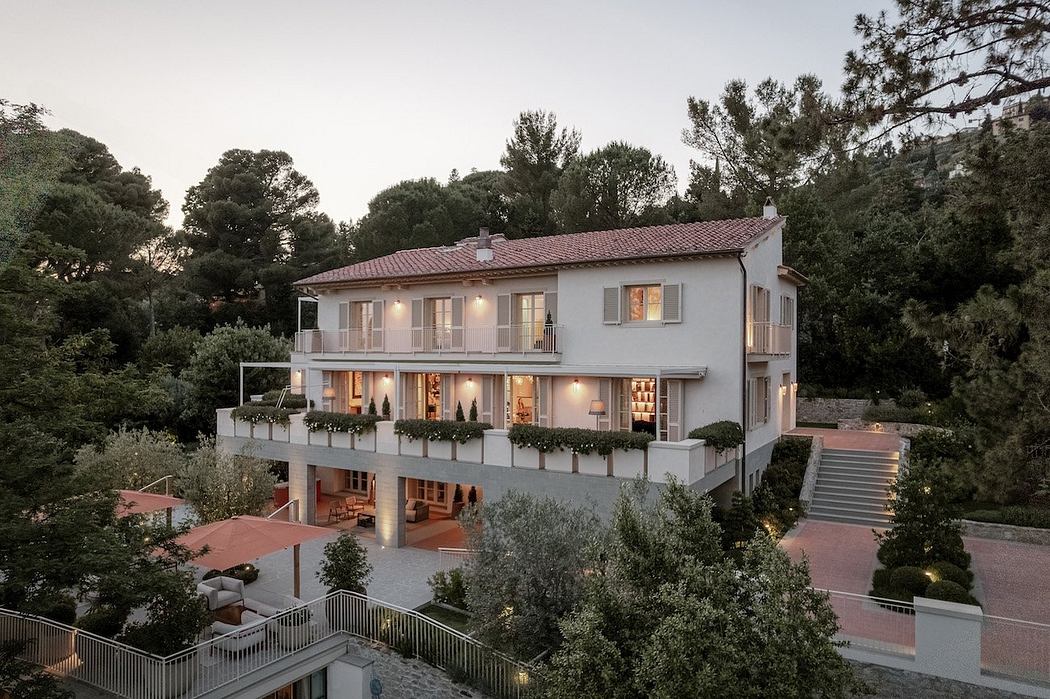
Villa M by Pierattelli Architetture Modernizes 1950s Florence Estate
31-10-2024 07:22 - (
Architecture )
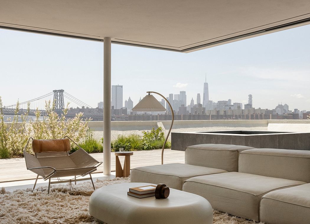
Kent Avenue Penthouse Merges Industrial and Minimalist Styles
31-10-2024 07:22 - (
Architecture )


