
SomeOne rebrands the House of Commons for the digital age
Design agency SomeOne has updated the visual identity of the UK's House of Commons to make it perform better across different platforms including apps and social media.
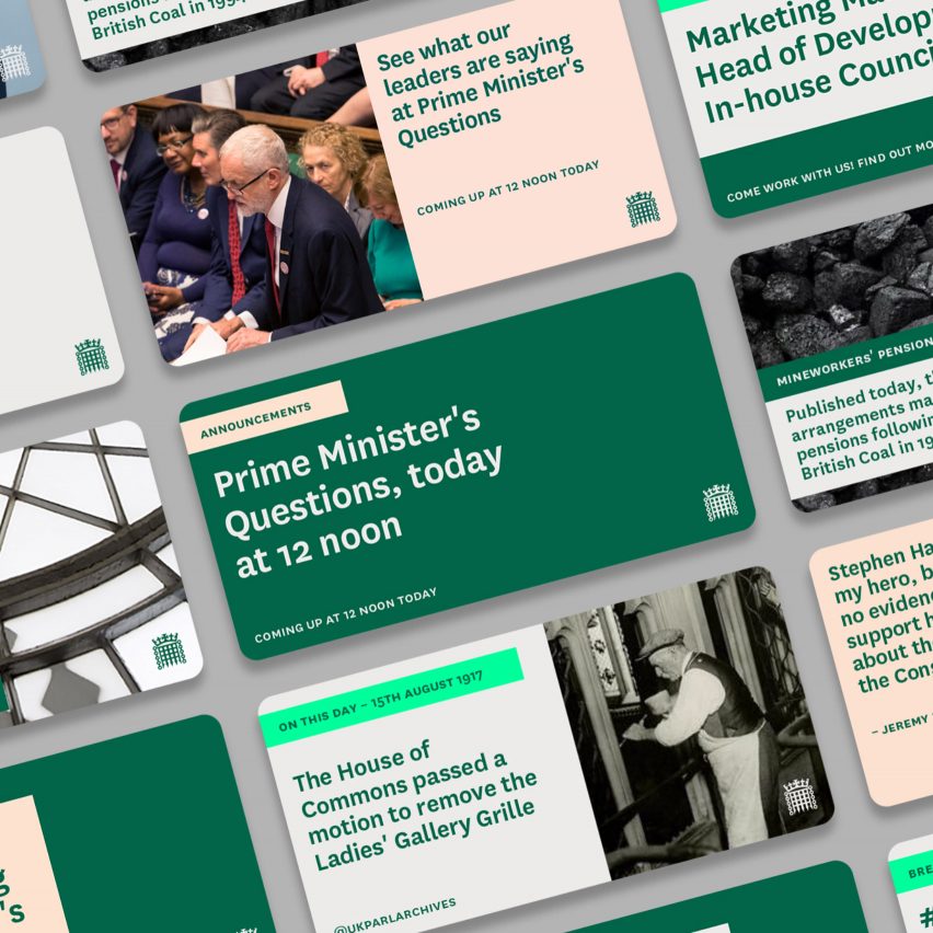
London firm SomeOne was tasked with a holistic rebranding project to improve consistency across all touch points, including procedural documents, signage and digital applications.
The existing core green colour that evokes the colour of the benches inside the House of Commons chamber has been updated to improve the contrast between different elements and enhance the legibility of type across all formats.
A new typeface, National, was chosen to work across application types and at all sizes for better reproduction on screen and different surfaces.
The lower house of the UK's parliament had been using its previous visual operating system since 2009. The identity comprised several design elements including a typeface and logo depicting a crowned portcullis, the emblem of both houses of parliament. The previous branding was developed with traditional printed publications and stationery in mind, but did not suit the many digital applications that emerged in the intervening years.
"An extensive range of House of Commons sub-identities had evolved over time and management of the visual identity as a whole had become complex and challenging," said the agency's founder, Simon Manchipp.
"The new connected identity system will help the House to communicate far more effectively on digital platforms,&qu...
| -------------------------------- |
| Alejandro Aravena named as 2016 Pritzker Prize laureate |
|
|

Villa M by Pierattelli Architetture Modernizes 1950s Florence Estate
31-10-2024 07:22 - (
Architecture )


