
Tatabi Studio designs marbled packaging for Diz-Diz microwave popcorn
Spanish studio Tatabi looked to ancient Greece to find influences for the branding and packaging design of a gourmet popcorn company (+ slideshow).
Tatabi apparently used Mount Olympus, the mythological home of the ancient Greek gods, as a reference for the colours, textures and aesthetic of the packaging.
"If the Gods eat popcorn, they would choose Diz-Diz," said the studio, which is based in Valencia and has worked on several food-branding projects.
The brief called for Tatabi to design a brand that would be both "luxurious and fun" and "colourful and elegant" at the same time.
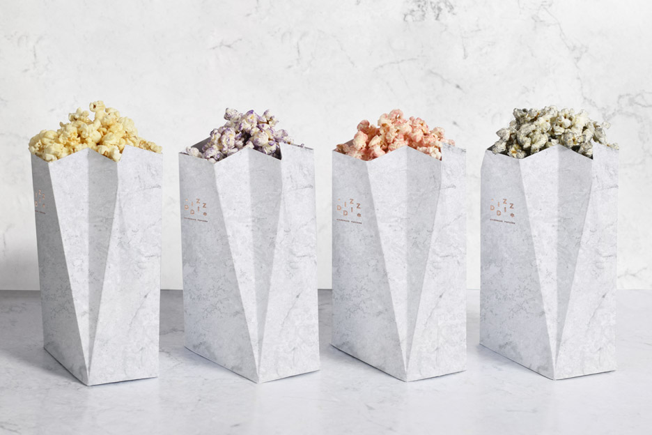
The bags of popcorn are covered in coloured foil, which has been designed to match the parmesan, curry, vanilla and cinnamon flavour range.
The material is repeated in the popcorn's branding, which includes a logo made from stacked sans-serif letters placed alongside an asterisk motif, and embossed in foil on the packaging.
"To enhance the luxurious and gourmet Diz-Diz aspect, we decided to combine the white marble colours and metallic materials," said the studio.
Related story: Nendo designs brand identity for skincare based on Chinese medicine
Bags are housed together in a set of all four flavours in a flexible plastic box, which is held in a marble-effect box with a sliding cover. The pattern is repeated in a paper container included with each packet ? similar to that used for cinema popcorn ? which can be used to hold the snack once micr...
| -------------------------------- |
| Fashion brand Milly's logo freezes up in new campaign by Sagmeister & Walsh |
|
|

Villa M by Pierattelli Architetture Modernizes 1950s Florence Estate
31-10-2024 07:22 - (
Architecture )


