
Taxi Studio designs human colon typeface for Never Too Young bowel cancer campaign
Bristol design office Taxi Studio has created a typeface that looks like intestines as part of the branding for Never Too Young, a campaign alerting young people to the dangers of bowel cancer.
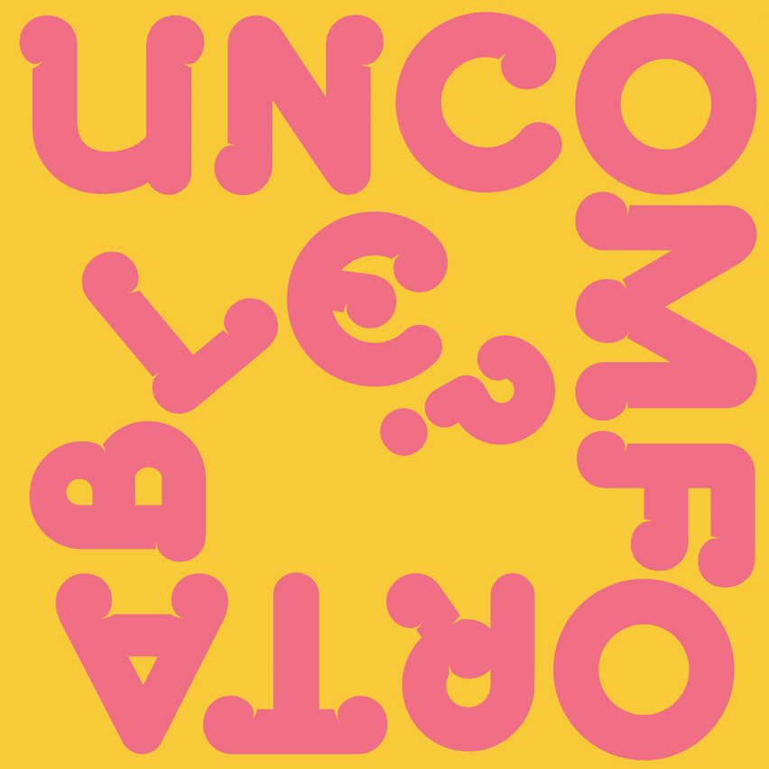
Based on the colon, an organ that is part of the digestive system, the typeface features on everything from posters to loo roll and spells out phrases such as "trust your gut" and "know your sh*t".
Never Too Young raises awareness about bowel cancer in young people
"The colon device became a clever, clear and simple shortcut to the brand," said Taxi Studio.
The branding is for Never Too Young, a project that is part of the charity Bowel Cancer UK. Led by a team of young people with bowel cancer, it raises awareness of the risk of developing the disease at any age. The typeface has two fonts, Sophia Display and Sophia Bold
The group was founded by the late Sophia Sangchi, a woman who was diagnosed with stage four bowel cancer at the age of 31, and a friend of Taxi Studio designer Charlie Tallis, who was the lead designer on the project.
Named Sophia Display in honour of Sangchi, who died in 2019, the typeface is a tumbling collection of twisty letters resembling a human colon.
The typeface mimics a twisty colon
"We devised ways to use the colon throughout its brand expression, from being part of the logo itself, to a headline, to appearing as ratios, times, fractions and even loo rolls," said Taxi Studio.
"Each is designed to help drive awa...
| -------------------------------- |
| Layer designs Bang & Olufsen speaker that "visually describes how the audio functions" |
|
|

Villa M by Pierattelli Architetture Modernizes 1950s Florence Estate
31-10-2024 07:22 - (
Architecture )


