
Thonik updates Dutch Design Week's graphic identity for 20th anniversary
Amsterdam studio Thonik took cues from the typography of graphic design legend Wim Crouwel to create a fresh identity for Dutch Design Week, marking two decades since the inception of northern Europe's largest design festival in Eindhoven.
The branding takes cues from a seminal poster designed by Crouwel for an exhibition on Dutch painter Edgar Fernhout, which was held at the city's Van Abbemuseum in 1963.
Thonik has created an updated identity for Dutch Design Week
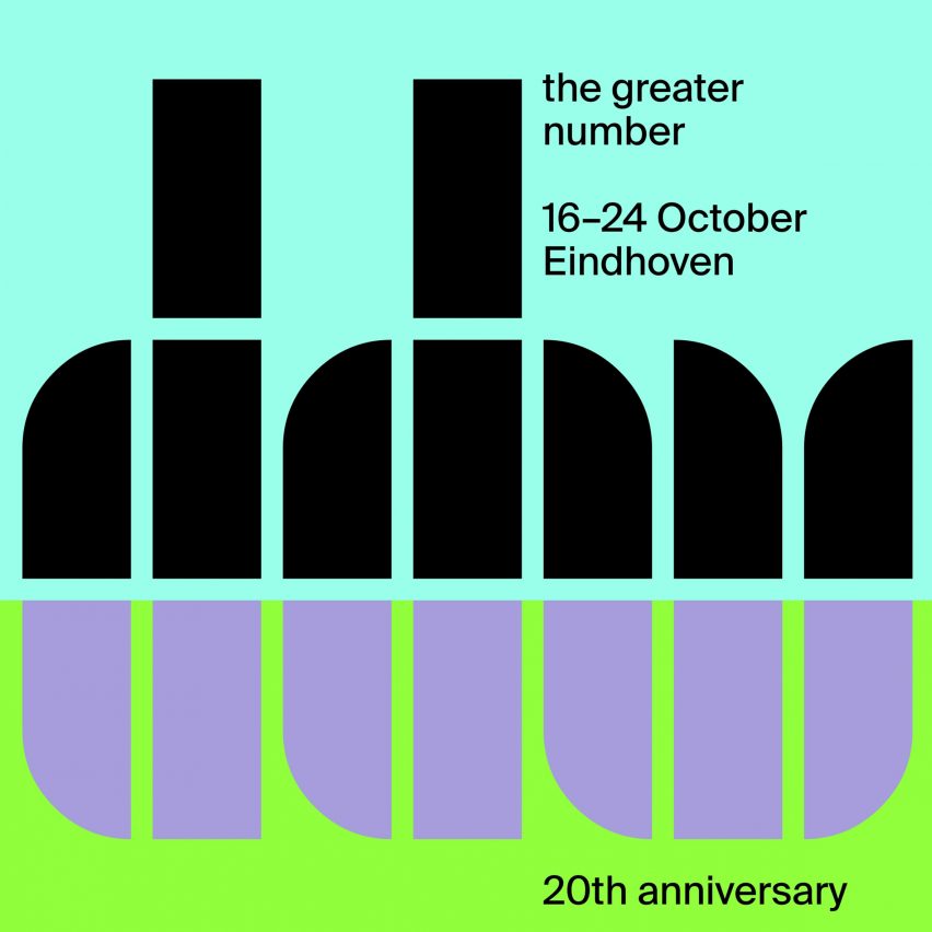
The poster features Crouwel's specially designed Fernhout typeface ? a collection of 13 chunky grid-based letters formed using quarter circles.
Thonik updated the identity for Dutch Design Week (DDW) using the characters featured on the poster and worked with London-based type foundry The Foundary Types to design the remaining 13 letters and complete the alphabet. The design was informed by the typography of Wim Crouwel
"The new identity goes back to the first identity of the festival, where DDW was written in a similarly constructed font," Thonik told Dezeen.
"In that way, it is a celebration of 20 years of Dutch Design Week."
Thonik's identity was included on signage during the festival
When written in the Fernhout typeface, the letter W in the DDW logo also resembles a tulip ? Dutch Design Week's longstanding logo and the national flower of the Netherlands.
The distinctive graphic identity was featured on a range of signage and wayfinding during the design festival, which ended last Sun...
| -------------------------------- |
| Carlo Ratti's sustainable orange squeezer serves juice in bioplastic cups made from the peel |
|
|

Villa M by Pierattelli Architetture Modernizes 1950s Florence Estate
31-10-2024 07:22 - (
Architecture )


