
Tinder replaces wordmark with pink and orange flame logo
Dating app Tinder has replaced its text logo with a slightly fatter gradient version of its well-recognised flame symbol.
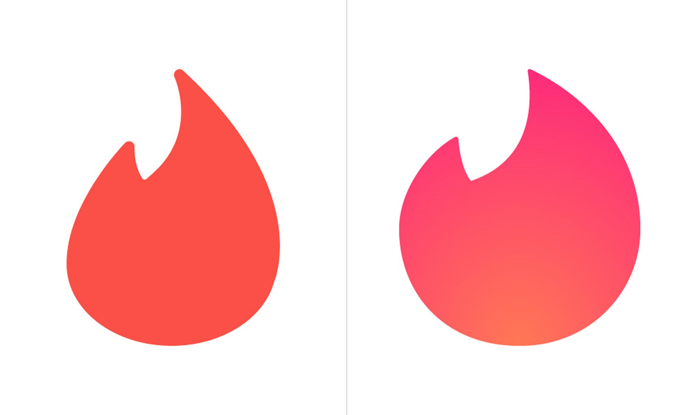
The icon, which had formerly occupied the place of the dot over the letter "i", has been given a gradient makeover and placed centre stage. Previously all-red, the symbol now fades from pink to orange, and has been redesigned with a slightly rounder body and spikier flame tip.
It's somewhat reminiscent of Instagram's 2016 logo redesign, which saw the social network replace its retro camera symbol with a pink, orange and purple gradient icon.
A side-by-side comparison of the old Tinder flame (left) and the new, fatter version (right)
The flame will now replace Tinder's previous logo altogether, serving as a standalone symbol for the company's app, and also its website ? which is using a cut-out version placed on a pink and orange gradient background. "Probably unbeknownst to anyone, the flame became, literally, the hottest app icon on people's phones and, now, reaching Nike Swoosh status, Tinder has decided to forego a wordmark and let the flame do all the brand heavy lifting," said Under Consideration editor and branding specialist Armin Vit of the redesign.
"And it works. I have never used Tinder and even I get the power of the flame and its ability to stand on its own."
The logo update follows an overhaul of the dating network's app, which has seen the company introduce a more "clean aesthetic" and simplified ...
| -------------------------------- |
| Quantum Stealth "invisibility cloak" can conceal people and entire buildings |
|
|

Villa M by Pierattelli Architetture Modernizes 1950s Florence Estate
31-10-2024 07:22 - (
Architecture )


