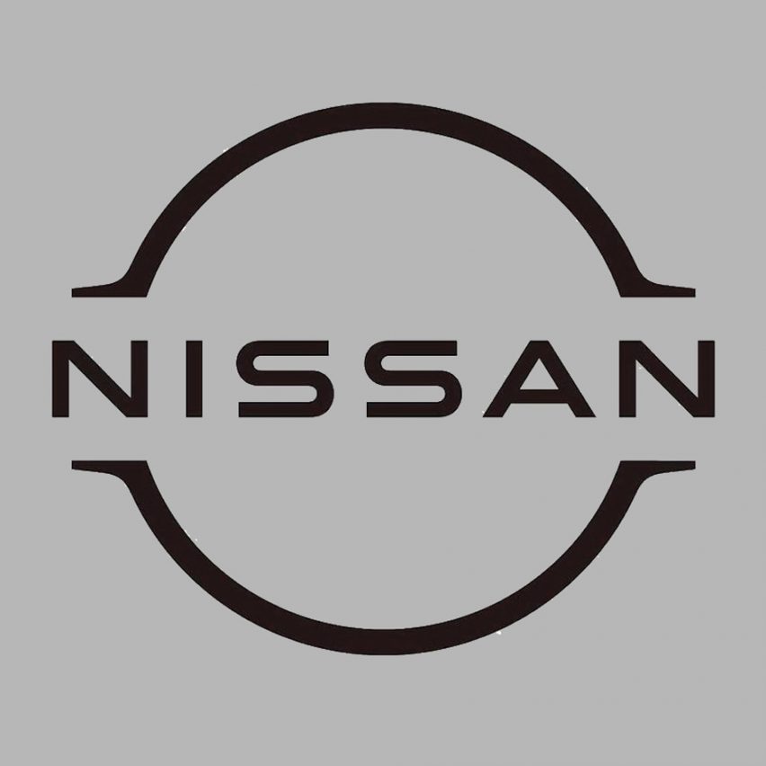
Trademark documents reveal Nissan's stylised flat logo

Japanese car brand Nissan has filed a trademark application for a flat monochrome logo that would see it join other brands opting for minimalist rebrands.
Documents filed in Great Britain, Peru, Uruguay, Chile, and Argentina show that Nissan has registered a flat, two-dimensional update of its existing logo.
The design references the two geometric forms that comprise the current logo ? a circle with a rectangle overlaid ? but reduces these to a pair of stylised lines enclosing the Nissan logotype.
The font is also reduced in weight and elongated slightly for a more agile aesthetic.
Images of the new logo have been circulating online, but when approached by Dezeen for comment, the company said the trademarked logo "may or may not be used for future products and or services". Carmakers follow minimal rebranding trend
If the logo is released, Nissan would join the trend for flat identity redesigns that are simpler and better suited to digital applications.
It would echo the redesigns of other automotive manufacturers including BMW, MINI and Volkswagen, which have all recently adopted flat, two-dimensional logos.
Nissan's original logo can be traced back to when the company took control of DAT Motors (formerly Datsun). Datsun's logo featured a blue rectangle placed over a red circle ? representing Japan's flag.
The company introduced the current chrome-effect logo in 2001. The three-dimensional reinterpretation of the original shapes was described as representing th...
| -------------------------------- |
| A modular building system to combat loneliness in cities" | Architecture | Dezeen |
|
|
Villa M by Pierattelli Architetture Modernizes 1950s Florence Estate
31-10-2024 07:22 - (
Architecture )
Kent Avenue Penthouse Merges Industrial and Minimalist Styles
31-10-2024 07:22 - (
Architecture )


