
Visual identity for Re:publica rebels against digital culture with reams of text
Fertig Design has created a visual identity for the Re:publica conference that uses lengthy passages of text and typography instead of conventional graphics to pay "homage to the written word".
The annual conference is the largest aimed at the digital and internet society, and saw its thirteenth edition this year in Berlin.
This year's theme and visual identity focused on TL;DR ? an abbreviation meaning "too long; didn't read" ? which is used to respond to overly long pieces of writing on the internet.
Commonly found at the end of a text, the shorthand notation is usually followed by a summary that readers can scan, rather than spending time studying the main text in detail.
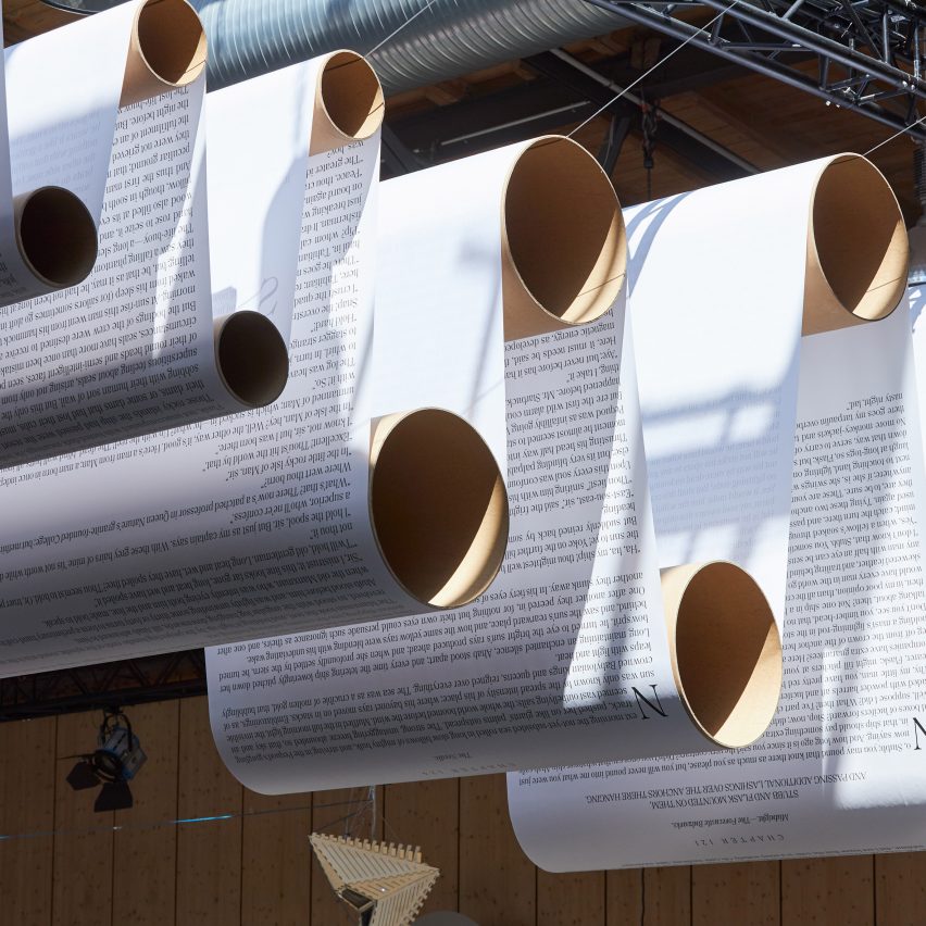
Through the visual branding, which has been longlisted in this year's Dezeen Awards, the conference organisers aimed to make their audience aware of the dangers and miscommunications that can stem from shortening information online. Re:publica's manifesto for the event was printed on all the conference materials, whilst an installation based around the notoriously long novel Moby Dick adorned the halls.
"Misinformation is so easy to transmit when everything is shortened," said Norman Palm, art director at Fertig Design. "Radical opinions thrive within 140 characters."
Palm told Dezeen that users can often find themselves overwhelmed by rapid-fire information, resulting in a lack of concentration and rushed discussions.
The studio intentionally used analogue and...
| -------------------------------- |
| Lumos smart bike helmet incorporates brake lights and indicators |
|
|
![Do Ceiling Fans Use a Lot of Electricity" [No, Not Really]](https://homeadore.com/wp-content/uploads/2024/04/001-west-loop-loft-refurbished-80s-loft-with-timeless-design-1050x724.jpg)
![Do Ceiling Fans Use a Lot of Electricity" [No, Not Really]](https://homeadore.com/wp-content/uploads/2024/04/001-9-east-studio-collective-offices-modern-redesign-in-chicago-1050x1266.jpg)
![Do Ceiling Fans Use a Lot of Electricity" [No, Not Really]](https://goodshomedesign.com/wp-content/uploads/2024/04/one-of-a-kind-off-grid-tiny-home-is-inspired-by-a-wwii-airplane-640x425.jpg)
![Do Ceiling Fans Use a Lot of Electricity" [No, Not Really]](https://goodshomedesign.com/wp-content/uploads/2024/04/a-boeing-737-was-transformed-into-this-luxurious-villa-640x425.jpg)
![Do Ceiling Fans Use a Lot of Electricity" [No, Not Really]](https://cdn.onekindesign.com/wp-content/uploads/2019/08/Relaxing-Beach-House-Retreat-Lauren-Nelson-Design-02-1-Kindesign.jpg)
![Do Ceiling Fans Use a Lot of Electricity" [No, Not Really]](https://cdn.onekindesign.com/wp-content/uploads/2024/04/Backyard-Grill-Station-Ideas-Summer-Entertaining-19-1-Kindesign.jpg)
![Do Ceiling Fans Use a Lot of Electricity" [No, Not Really]](https://www.arch2o.com/wp-content/uploads/2023/11/Arch2O-pharo-office-building-park-associati-35-700x337.jpg)
![Do Ceiling Fans Use a Lot of Electricity" [No, Not Really]](https://www.arch2o.com/wp-content/uploads/2023/11/Arch2O-tenjin-business-center-oma-6-700x467.jpg)
![Do Ceiling Fans Use a Lot of Electricity" [No, Not Really]](/images/defect.gif)
![Do Ceiling Fans Use a Lot of Electricity" [No, Not Really]](https://static.dezeen.com/uploads/2024/04/guest-rooms-lookbook-2024_dezeen_2364_sq-1-852x852.jpg)
![Do Ceiling Fans Use a Lot of Electricity" [No, Not Really]](https://static.dezeen.com/uploads/2024/04/sq-plato-contemporary-art-gallery-kwk-promes-czech-republic_dezeen_2364_col_3-852x852.jpg)
![Do Ceiling Fans Use a Lot of Electricity" [No, Not Really]](https://static.dezeen.com/uploads/2024/04/florence-institute-of-design-international-fidi-dezeen-schoolshows_dezeen_2364_col_2-852x852.jpg)
![Do Ceiling Fans Use a Lot of Electricity" [No, Not Really]](https://static.dezeen.com/uploads/2024/04/equestrian-san-ramon_modica-ledezma_dezeen_sq2-852x852.jpg)
![Do Ceiling Fans Use a Lot of Electricity" [No, Not Really]](https://static.dezeen.com/uploads/2024/04/f-mk-g-water-pressure-exhibition-curators-pick_dezeen_2364_col_0-852x852.jpg)