
Yuta Takahashi designs minimal packaging for natural chocolate bars
Japanese designer Yuta Takahashi created the pared-back packaging for these natural chocolate bars to reflect their simple ingredients (+ slideshow).
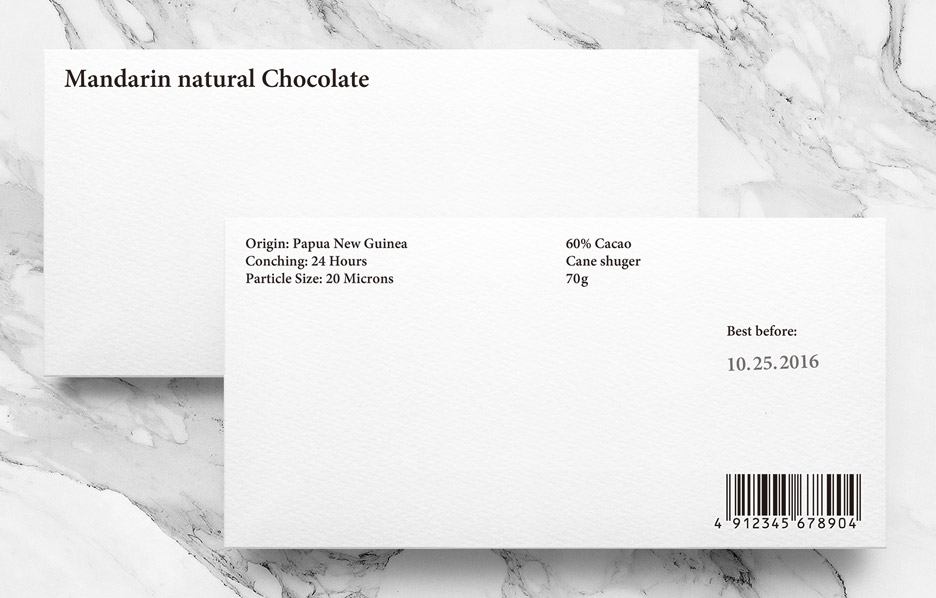
Takashi designed the minimal wrappers and branding for Mandarin Natural Chocolate ? a confectionary company which makes chocolate bars using only organic cacao and cane sugar.
Keen to represent the company's use of pure ingredients, Takashi's identity features lettering in a simple black-coloured serif font against a plain white background.
The wrappers are made from textured cardboard, with a layer of foil beneath to keep the chocolate fresh.
Related story: MUT Design's Onza tiles resemble slabs of chocolate
A line of 10 dots on the packaging subtly indicates the chocolate's intensity. Each one coloured black represents 10 per cent of cocoa in the mixture: so six black dots equals 60 per cent cocoa.
"Cacao has a brown colour, not altered by intentions or designs," Takashi told Dezeen. "Similarly, we wanted to express the rigour of this brand, our intention to pursue quality materials and exclusion of unnecessary ones by using pure colour."
"We felt that we wanted a typeface with pointed serif to express the sharpness we feel when we hold high-quality chocolate in our mouths," he added
The best before date and barcode are printed on the reverse along with a list of ingredients.
Takahashi's branding extends to a stationery range that includes business cards, envelope...
| -------------------------------- |
| Scroll wins Dezeen and LG Display's OLEDs Go! competition | Dezeen |
|
|

Villa M by Pierattelli Architetture Modernizes 1950s Florence Estate
31-10-2024 07:22 - (
Architecture )


