Zara logo gets controversial revamp by Baron & Baron

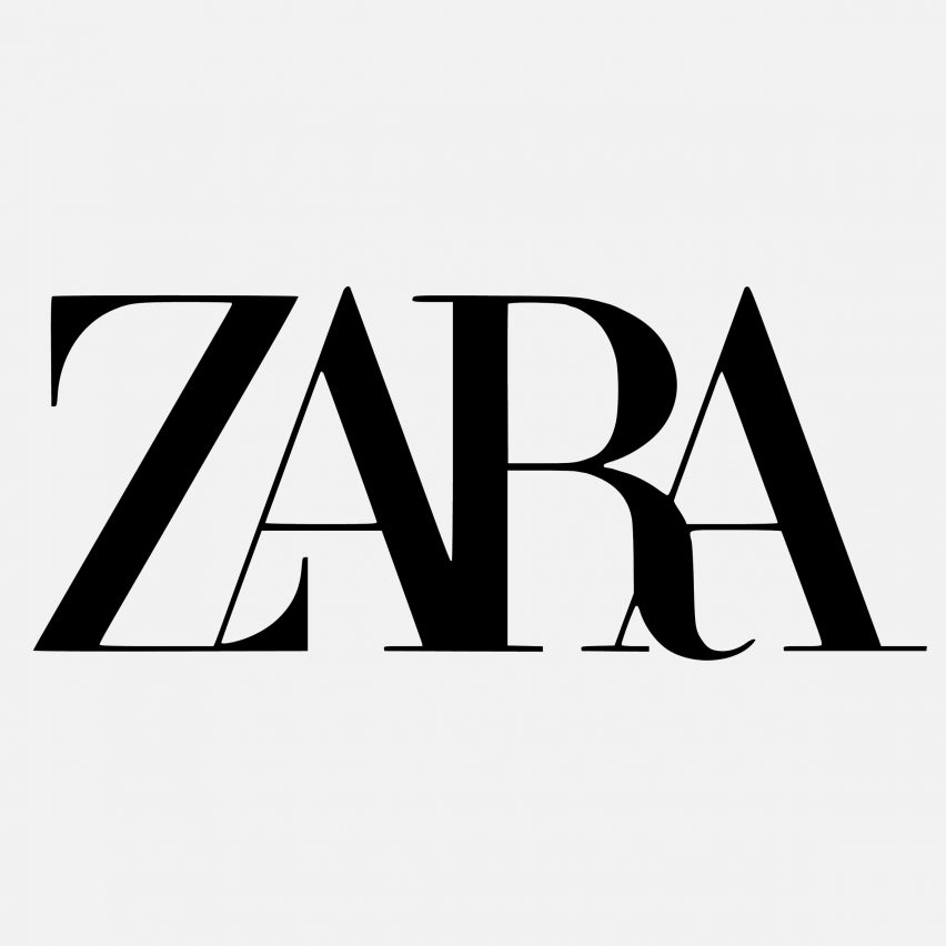
Letters overlap one another in the new logo for Spanish fashion retailer Zara, designed by French agency Baron & Baron, prompting criticism from fellow designers.
The rebranding features a minimal typeface, similar to the one used in the previous logo that was released in 2011, which saw the letters ZARA printed in block capital serif characters with large spacing in between. But instead of generous gaps in between the letters, the text is pushed up closely together so that some parts overlap and others merge together. Details have also been exaggerated, so there are now curved accents on the Z and R letters.
...
| -------------------------------- |
| SUMIDERO |
|
|
Villa M by Pierattelli Architetture Modernizes 1950s Florence Estate
31-10-2024 07:22 - (
Architecture )
Kent Avenue Penthouse Merges Industrial and Minimalist Styles
31-10-2024 07:22 - (
Architecture )


