
Citroën returns to original logo to create "symbol of progress" for electric era
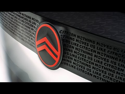
French car manufacturer Citroën has unveiled a new logo which looks similar to the brand's original 1919 logo, to mark the "start of a new era", in its mission to make electric vehicles more accessible.
The new logo and branding was created by the Citroën design team and global brand design agency Stellantis Design Studio and sees the return of the oval to enclose the automaker's deux chevrons ? two upside-down V's that resemble chevron herringbone patterns.
This change, according to Citroën, was an acknowledgement of the brand's original logo first adopted by founder André Citroën and helps the rebrand feel "new but familiar".
The logo will be first used on a conceptual Citroën family vehicle at the end of September, before being rolled out to all Citroën models from mid-2023 onwards.
Read more on Dezeen: https://www.dezeen.com/"p=1848258
WATCH NEXT: Pentagram evokes speed with branding for online car shop Vroom - https://youtu.be/6qkjIG6gwek
Subscribe to our YouTube channel for the latest architecture and design movies: http://bit.ly/1tcULvh
Like Dezeen on Facebook: https://www.facebook.com/dezeen/
Follow Dezeen on Twitter: https://twitter.com/Dezeen/
Follow us on Instagram: https://www.instagram.com/dezeen/
Check out our Pinterest: https://uk.pinterest.com/dezeen/
...
_MFUENTENOTICIAS
dezeenmagazine
_MURLDELAFUENTE
https://www.youtube.com/user/dezeenmagazine
| -------------------------------- |
| MUROS DE PIEDRA. Tutoriales de Arquitectura. |
|
|

Villa M by Pierattelli Architetture Modernizes 1950s Florence Estate
31-10-2024 07:22 - (
Architecture )


