London restaurant Jolene uses logo drawn by a six-year-old child
Lettering scribbled by the young son of graphic designer Frith Kerr provides the logo for north London restaurant Jolene.
The Studio Kerr founder turned to her six-year-old son to create the logotype, which provides the brand identity for the restaurant and bakery located in Newington Green.
The team were looking for a logotype "to provoke the naive simplicity Jolene is expressing".
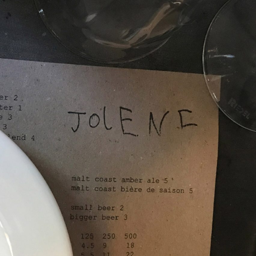
The logotype was handwritten by the six-year-old son of Frith Kerr, founder of Studio Kerr
Kerr chose the final design from a number of written variations. The sloping handwritten letters are a mix of lower and upper cases, and are unmistakably the work of a young child.
"The final logotype was selected for the inimitable spacing and crescendo of elegant sans-serif capital letterforms," said Kerr. As well as being printed on the daily menu, the logotype is printed on paper and tote bags
The resulting logo appears on canvas totes and paper carrier bags. It can be found in the interior design of the restaurant, sewn onto curtains, as well as printed at the top of the daily menu.
"The logotype's handmade nature also has the potential for it to exist in many forms without it feeling out of place with the space, whether it's embroidered on a window curtain or stamped loosely on a menu," said Studio Frith.
It is intended "to provoke the naive simplicity Jolene is expressing"
Jolene opened in September 2018. It is the third space from restaurateur Jerem...
| -------------------------------- |
| Nowatch is a health-focused smartwatch that doesn't tell the time |
|
|