
Minimalist McDonald's adverts feature ingredients lists but no brand name
Advertising agency Leo Burnett has designed minimalist posters for McDonald's with just lists of ingredients in the Helvetica font and no mention of the fast food chain's name.
London-based agency Leo Burnett teamed up with Minneapolis-based designer David Schwen to create the Iconic Stacks campaign for outdoor billboards.
The "redacted" adverts have done away with both images of food and the McDonald's name itself, focusing wholly on the typography.
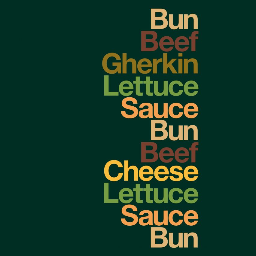
The duo chose some of the brand's most popular food items, such as the Big Mac, the Sausage & Egg McMuffin and the Filet-O-Fish, and broke them down into a list of their main components.
The Sausage & Egg McMuffin, for instance, becomes "Muffin, Egg, Sausage, Cheese, Muffin". Each word ? written in Helvetica typeface ? is stacked on top of the other, mimicking the arrangement of the food itself, and is coloured in a shade reminiscent of the ingredient it references.
"The minimalist approach developed from the needs of the communication. Simplicity. Nothing should distract. Everything is a 'slave' to the idea. Everything provides and earth wire back to the brand," Heyes told Dezeen.
"Funnily enough, a designer accidentally put the logo on the initial artworks," he continued. "That moment when you put your thumb over the logo and remind yourself of how strong this work is... that's what we all get out of bed for."
The Iconic Stacks posters were launched last week and wi...
| -------------------------------- |
| Movie captures making of Neri Oxman pavilion spun by 17,532 silkworms |
|
|

Villa M by Pierattelli Architetture Modernizes 1950s Florence Estate
31-10-2024 07:22 - (
Architecture )


