Monotype redesigns Helvetica font for digital age

Typeface company Monotype has overhauled the Helvetica typeface over 60 years after it was first created to give it a fresh new look for the 21st century.
Spearheaded by the company's type director Charles Nix, Monotype's redesign provides a new take on the typeface that Swiss designer Max Miedinger created in 1957.
Monotype updated Helvetica to solve "legibility and style challenges"
Called Helvetica Now, the new family of 48 fonts and three sizes is intended to optimise the original version for use in digital graphic design, and allow more flexibility and improved legibility for branding.
"Older versions of the font were lacking in some important areas," Nix told Dezeen. "Helvetica Now solves the legibility and style challenges that brands using Helvetica have consciously and unconsciously faced for years." Called Helvetica Now, the update comprises 48 fonts and three sizes
The new design combines clarity, simplicity, and neutrality; an "often-repeated mantra" Monotype used to guide themselves through the process of redesigning the nearly 40,000 characters.
Described by Nix as "screen-first font", the updated typeface includes additional alternate characters and typographic tools.
There are also a host of symbols to suit different graphics
Some features, like the glyph "f", resembles code typography, as the line through the stem is slightly pinched.
Since its creation in the 1950s, Helvetica's design has gone th...
| -------------------------------- |
| Glastonbury 2019 architecture and design highlights | Dezeen |
|
|
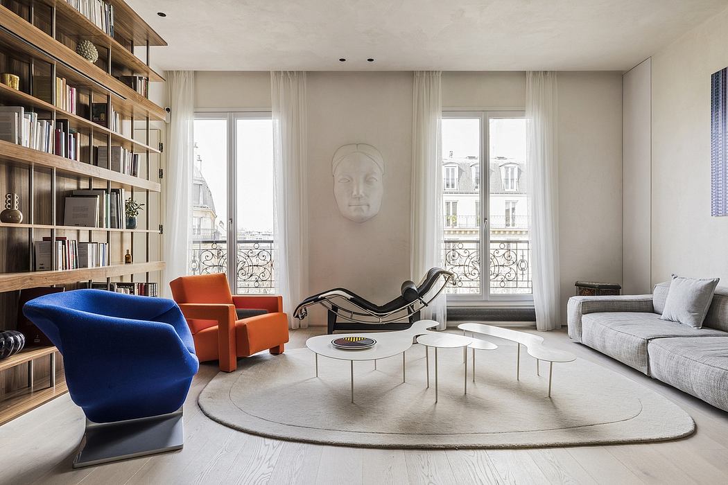
House for 2 Architects: Renovating a 19th-Century Paris Apartment
25-04-2024 08:32 - (
Architecture )