Origami crane informs Nendo's minimalist overhaul of Japan Airlines amenity kits
Nendo has completed a comprehensive makeover of all of Japan Airlines' in-flight amenities, from meal trays to slippers and earplug wrappers, which draws on the lines of a paper crane.
The revamp is based on the national carrier's logo ? a traditional crest known as a tsurumaru, in which a crane forms a circle with its outstretched wings.
Above: blankets feature folded red corners. Top image: the design was informed by the motif of an origami crane
This motif is extrapolated into a more minimalist, red origami bird that, according to Nendo, acts as "a symbol of peace, prayer and the spirit of hospitality".
Its graphic folds are referenced throughout the entire line of products, with a tag attached to accessories such as eye masks, slippers and pillows nodding to the shape of its pointed wingtips. Red tags pop up throughout the product line
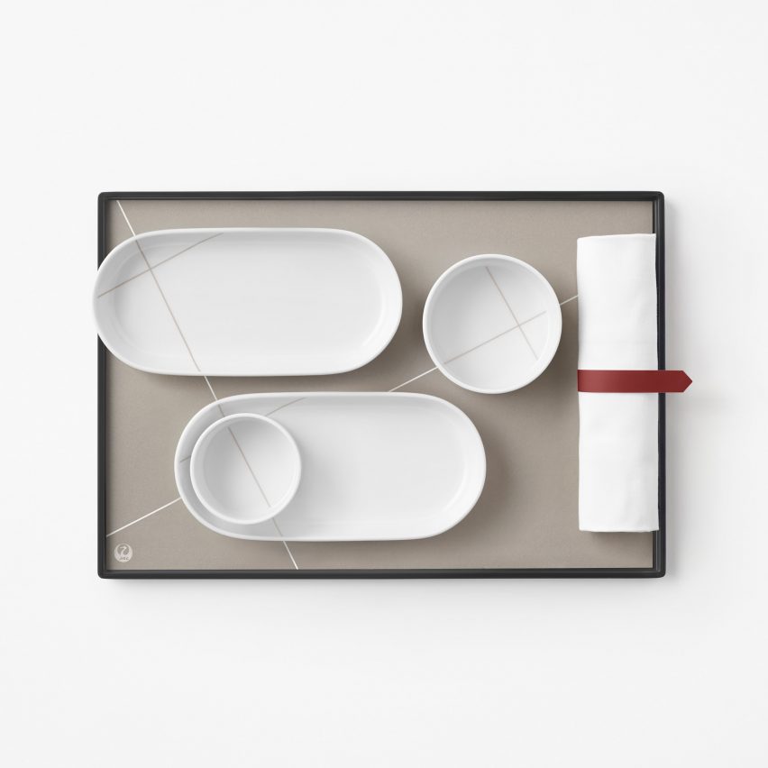
A similar red band resembling an inverted bookmark is also wrapped around the rolled-up napkins that hold the cutlery, while the paper crane's triangular head is referenced in the folded corners of blankets, tablecloths and napkins.
Elsewhere Nendo took a more abstract approach, incorporating the tessellated patterns that are left behind on a piece of paper when the origami bird is unfolded.
Cosmetics blags are emblazoned with the crane's folding patterns
These are found on the in-flight cosmetics bags as well as on the cartes du jour, where the linework helps flight attendants differentiate between Western and Japanese menus'.
...
| -------------------------------- |
| UNStudio's Raffles City Hangzhou is an "all-in-one destination" featuring twisting glass towers |
|
|