Periods for Periods is a typeface of fullstops to protest period poverty

A total of 140 designers from around the world including Pentagram's Giorgia Lupi have collaborated to produce a blood-red typeface made out of punctuation to highlight period poverty in American schools.
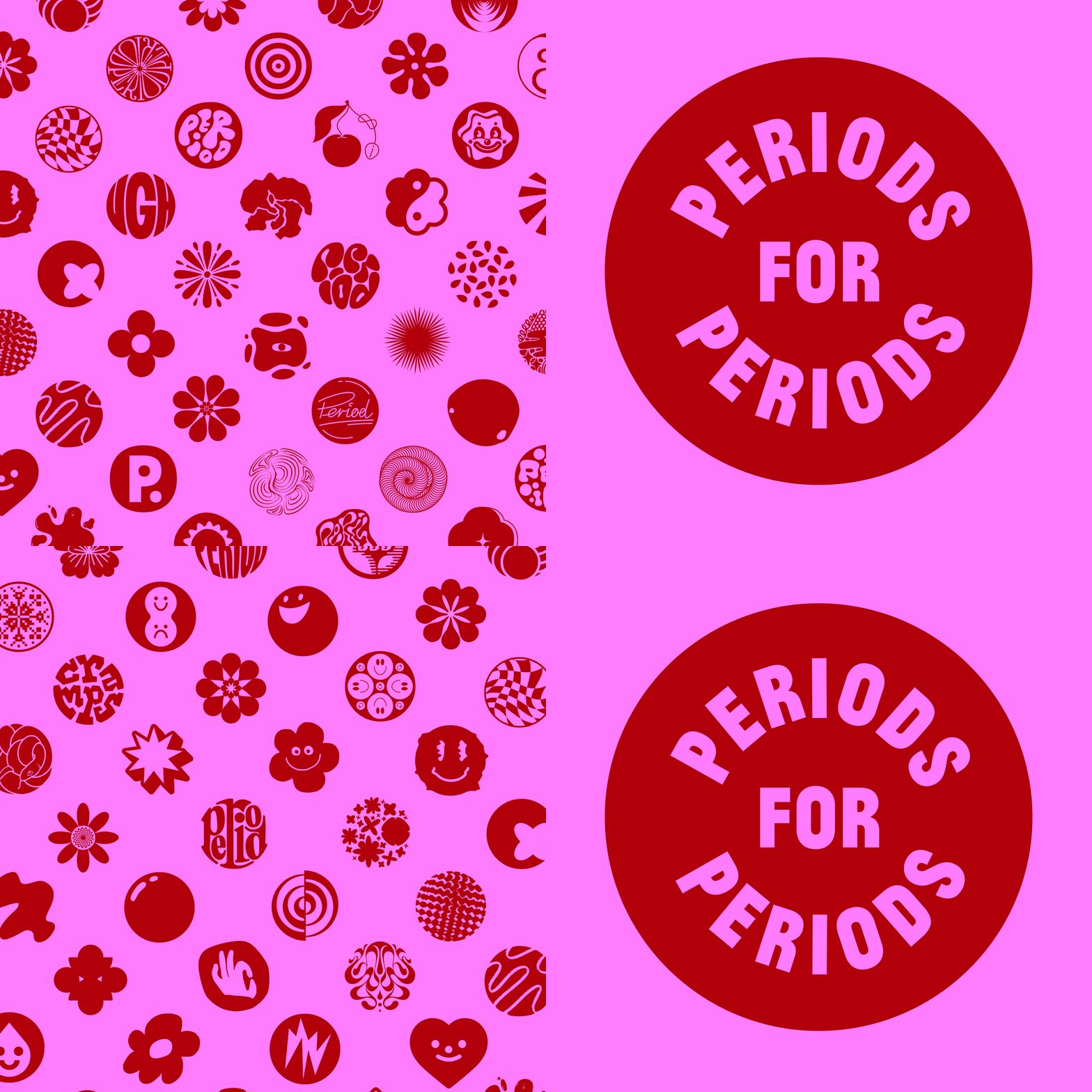
Called Periods for Periods, the typeface is a group of loosely circular, playful shapes that are "periods" ? a play on the common American word for full stops.
Periods for Periods is a typeface of full stops
Canadian agency Rethink Communications asked designers, illustrators and typographers to create their own take on the punctuation, which is available to download as a typeface through the Periods for Periods website.
"We created this font as a protest against the current requirement for young people to pay for period products in schools," Rethink Communications told Dezeen. "One in seven teens have missed school due to a lack of period supplies." The campaign uses menstrual-themed pink and red
Periods for Periods' proliferation of punctuation designs are intended to communicate the campaign's tagline, "end a sentence, start a revolution".
The project aims to raise awareness of period poverty in schools across North America, although people who menstruate experience a lack of access to sanitary products all over the world.
140 creatives lent their talents to create graphics
Designers created a wide range of full stops for the typeface, ranging from literal to abstract shapes.
Pentagram designer Giorgia Lupi created an asterisk-lik...
| -------------------------------- |
| DISEÃO DE UNA CASA EN TERRENO INCLINADO. 4. La trama. |
|
|
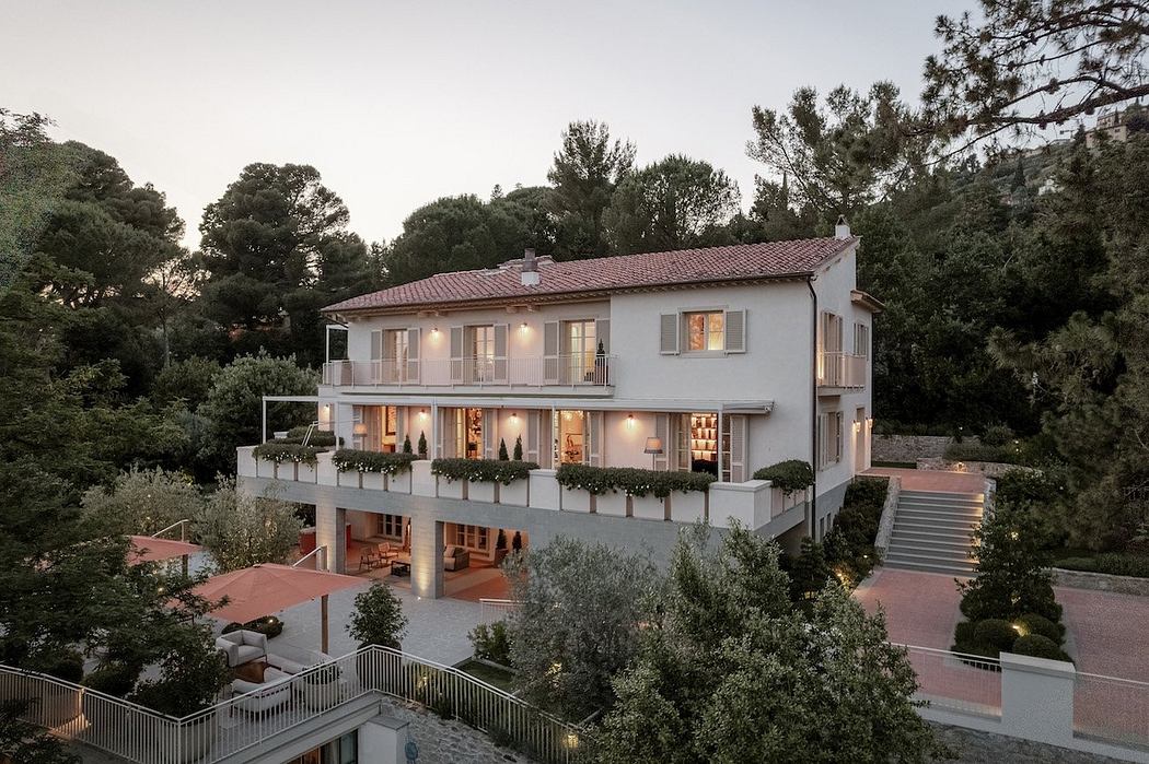
Villa M by Pierattelli Architetture Modernizes 1950s Florence Estate
31-10-2024 07:22 - (
Architecture )
Kent Avenue Penthouse Merges Industrial and Minimalist Styles
31-10-2024 07:22 - (
Architecture )


