Ten interiors with pastel colours that freshen up the home for spring
For this lookbook, we've rounded up ten home interiors decorated in pastel tints that show how ice-cream colours can give spaces a fresh, calming look.
The selection from our archive, which includes bathrooms to bedrooms and kitchens, shows how pastels ? made by adding white to pure colours to make them more luminous and less saturated ? can create a spring-like feeling.
Never really out of fashion, pastels have strong psychological associations with new life with their pale, cheery tints representing a midway stage between the darkness of winter and the full-blown colour of summer.
This is the latest roundup in our Dezeen Lookbooks series providing visual inspiration for the home. Previous articles in the series feature rooftop gardens, bright kitchens, interiors with statement plants, terrazzo kitchens, and stylish home offices.
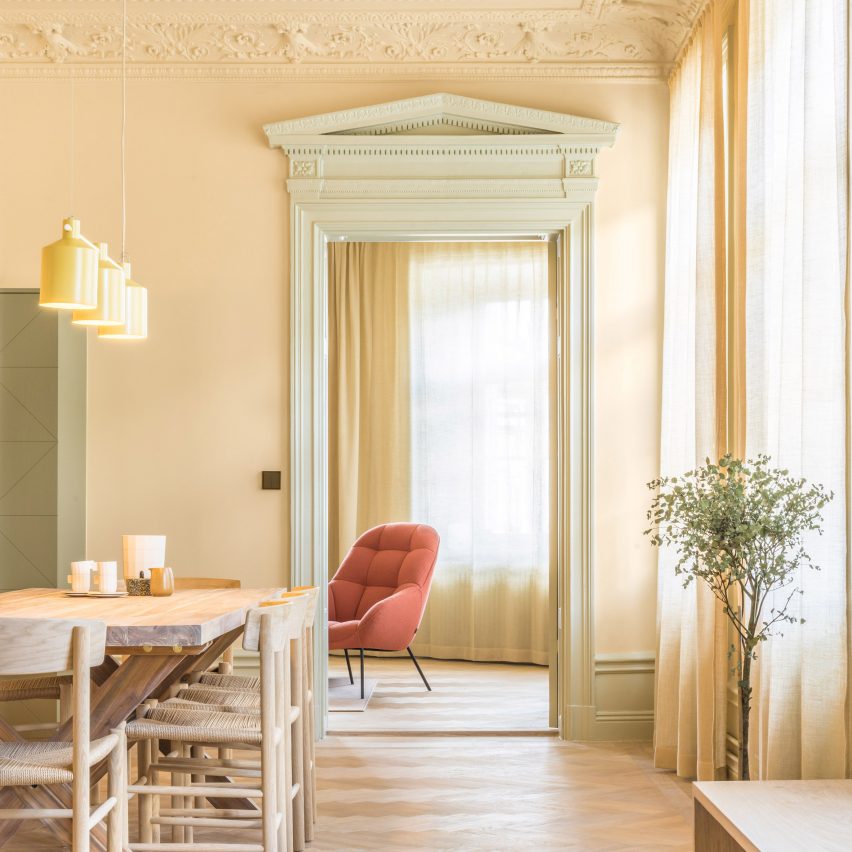
Hidden Tints, Sweden, by Note Design Studio
A warm, yellow tint covers the walls of this Stockholm apartment designed by Note Design Studio, which is filled with different pastel colours. A pale, spring-like green complements the yellow and is picked up in the plants dotted around the space.
Wooden furniture matches the gleaming wooden floors, while a pale orange Mango lounge chair by Note Design Studio for Wendelbo adds a touch of colour. The light above the table is SILO Trio by Note Design Studio for Zero.
Find out more about Hidden Tints ?
Longhouse, Australia, by Partners Hill
The dining room of this shed-style home in Australia has been...
| -------------------------------- |
| JUNTA. Vocabulario arquitectónico. |
|
|