US Open's flaming tennis ball logo receives minimal update

New York branding and graphics firm Chermayeff & Geismar & Haviv has pared back the "complicated" flaming ball logo of the US Open Tennis Championships to just three yellow stripes and lower-case text.
Chermayeff & Geismar & Haviv created the more minimal version of the logo to bring the 50-year-old United States Open Tennis Championships into the digital age and give it a more "youthful appeal".
The new design simplifies the golden tennis ball with flames billowing behind, which has represented the event since 1997, into three yellow marks that are pointed at one end and rounded at the other to resemble the shape of a tennis ball in flight.
The old US Open logo (right) compared to its minimal update A red streak was stripped away in favour of a plain blue backdrop, while the thin capital serif type spelling "US Open" has been swapped for italic sans-serif typography in lower case. The "n" at the end of the text now resembles a flipped version of the "u" at the beginning.
"The mark that had been used for 20 years ? an illustration of a flaming ball paired with thin serif type and a red swoosh ? was a complicated image that had challenges in digital media and did not represent the tournament well as a premium sporting and entertainment brand," said Chermayeff & Geismar & Haviv.
"While the rendition of the mark posed challenges, the core concept of a flaming tennis ball still captures...
| -------------------------------- |
| LA ESCALA Y SUS USOS. Tutoriales de arquitectura. |
|
|
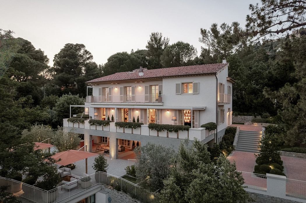
Villa M by Pierattelli Architetture Modernizes 1950s Florence Estate
31-10-2024 07:22 - (
Architecture )
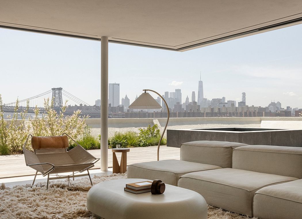
Kent Avenue Penthouse Merges Industrial and Minimalist Styles
31-10-2024 07:22 - (
Architecture )


